The parlance of architecture is filled with jargons, especially about Modernism and its consequent ‘isms’; less is more, less is a bore. Being firmly rooted in the former, I have been captivated by Meany Middle School’s understated elegance since I arrived on the Hill, some 13 years ago. For me, its simple forms and restrained detailing (less is more) speak volumes to many of modernism’s most successful pursuits: economy of form, subtractive design, and the harnessing of daylight – a great benefit during the Hill’s rather gloomy winter months. As fortune (and a little planning) would have, the day I explored Meany was a sunny winter day, whose resulting deep shadows proved well suited to best show-off Meany’s qualities.
Meany’s most eye-catching feature is its saw-tooth roof. Such roofs originated in factory or assembly buildings, in the latter half of the 19th century and persisted well into the early 20th. One we have lost – such as on the re-developed Sunset Electric – was a fine example of this typology. The advent of inexpensive gas or electric light spelled the demise of such welcome features, until they were resurrected by modernists who were not only captivated by their ability to foster better day-lighting but were also doubtlessly a fan of their rigorous, platonic forms. Meany’s roof readily displays those qualities, while adding its own take; for instance, the clear delineation of the concrete frame and infill as well as the continuous sunshade that provide a clean break from the saw-tooth form and the lower mass of the building, emphasizing the saw-tooth mass even more. Although not requisite in achieving elegance, the repeating of the saw-tooth nine times amplifies its desirable traits.
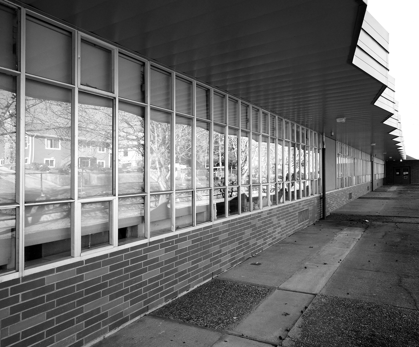
Although the school was closed on the Sunday of my visit, a peek through the glazed entry-doors revealed a brightly lit corridor, even though the electric lights were turned off. Note how evenly the daylight from the saw-tooths illuminate the corridor throughout its length. It’s unfortunate that such features are no longer as common as in the past, as I am certain that the abundance of daylight in the classroom has nothing but positive impacts on the students and faculty.
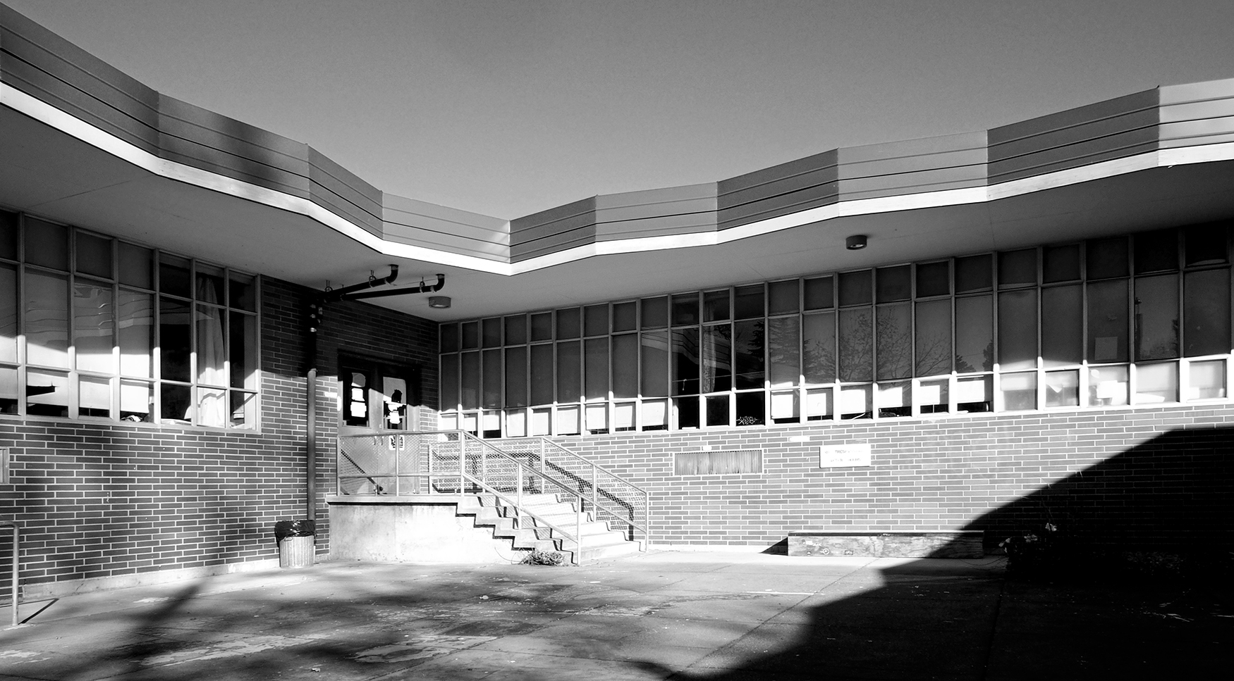
A view of the northern most saw-tooth shows that it is neighborless, revealing a simple composition of skylight and window. Again, repeating, simple forms with just a hint of hierarchy (the posts between the windows and the brick wainscot, for instance) maintains the simple approach.
The small dimensional change seen between the saw-tooth frame and infill is seen at the stair, where the walking surface of the landing and staircase is about 8 inches past (or ‘proud’) of the adjacent brick. Even though the stairs and saw-tooth could not be more different, the same sensibility of revealing the difference between structure and infill is used in the detailing of both elements. I get excited when I see such conviction displayed on otherwise disparate elements, as it exhibits a rigor absent from many buildings of more recent vintage.
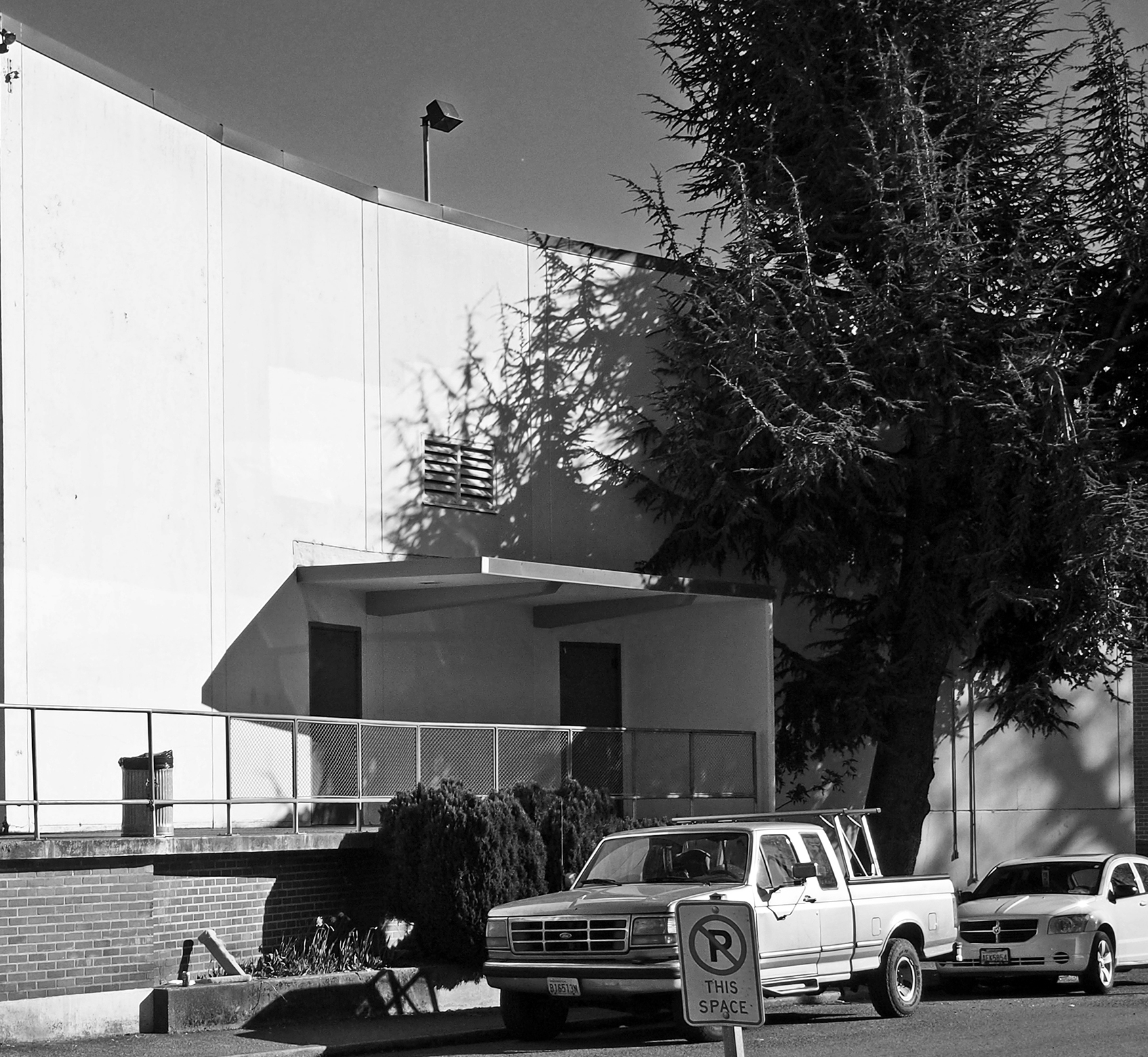
A bit more difficult to see, but equally as exciting, is the treatment of the (auditorium/gymnasium?) entry just south of the stair. In this case (and you’ll have to trust me, as the truck obscures the detail), the slab edge transitions to the wall, which then transitions into the canopy. It gets even cooler. I would argue that the asymmetry of the entrance (open to the north, closed to the south) reflects the disposition of the saw-tooths. Programmatically different from any other part of the school in both its use and volume, the school’s architect felt something special should happen to mark its difference; a curved, concave wall does the trick.
Evidence of the school’s mid-century roots continue on some of the building’s less noticeable portions. Here, a peculiar, saw-tooth roof edge is seen. Whether it is in homage to the saw-tooth skylights, or to the then current fascination with folded concrete forms is impossible to know. What I can speculate though, is that the roof’s underside framing the top of the window was a common modernist move, showing the architect’s goal of creating a unified inside/outside relationship by having a common plane uniting both. The continuous windows achieve the same goal. Built in the early 1960s, this building did not have to meet today’s stringent energy conservation goals; the dark sheet metal just above the edge of the concrete roof is most likely not original, but was added to conceal the current requirement for greater amounts of roof insulation. Where remedial action was in greater need -- such as in the second photo -- the concrete roof slab was entirely subsumed by the sheet metal. The solution is perhaps a technically satisfactory one, but it negates the elegance of the original. The continuous windows remain, their insistent sameness repeating a rich texture that partners well with the profile of the roof.
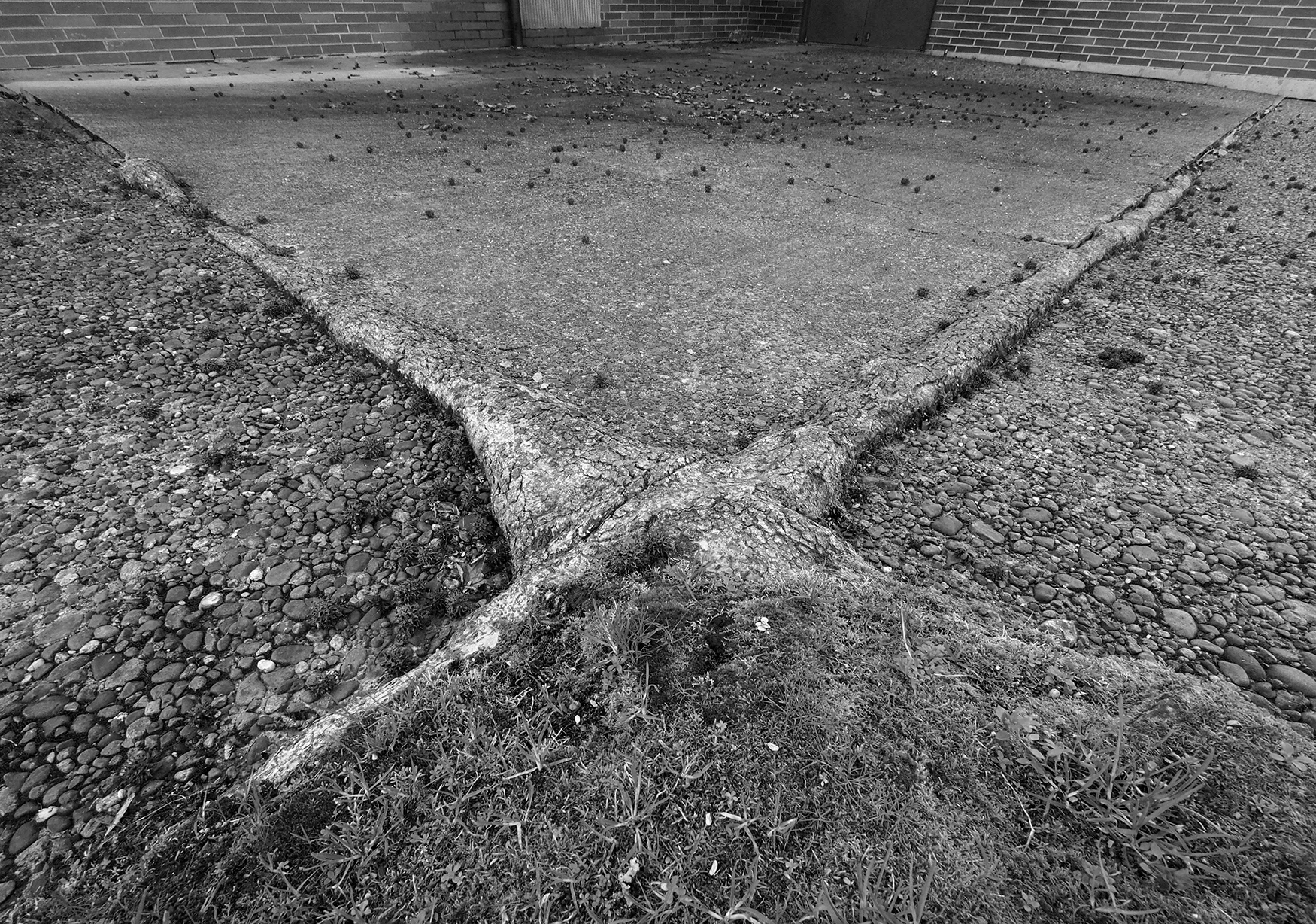
Many pleasant architectural discoveries were made that cool February morning, including the parting image, below, where the roots of one of the several sycamore trees on the school’s eastern side have over the years exerted great energy and determination to spread and seek sustenance – another reminder of the school’s fifty-plus years.


