The heritage structures along Capitol Hill’s Pike-Pine corridor house mixed use, residential, and commercial tenants. The most prominent and best preserved of these buildings are the large number of former auto showrooms, the so-called auto-row buildings that are comprised of large-span ground floor spaces with high ceilings. Some heritage structures originally housed, as they do today, a mix of uses with ground floor retail and housing above. Some are strictly residential. These original patterns of development, or more specifically the pattern or planning for the building’s use, are reflected in their elevations. In those buildings along Pike-Pine that were originally commercial, the ground floor has expansive amounts of glass which are crisply framed by the building’s structure, with the resulting clarity carried out on the upper floors with little variation. A typical example of this rational, commercial frame expression can be seen along Pine Street, between Crawford Place and Summit Avenue.
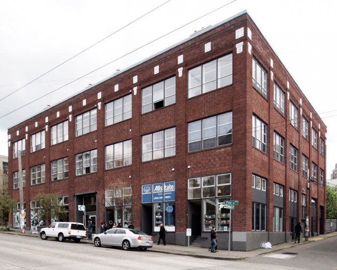
Typical Pike-Pine Heritage Commercial Building
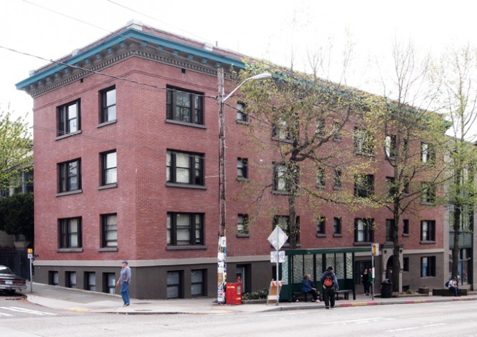
Capitol Hill’s residential buildings too, have a similar uniformity of expression between the ground and upper floors. In residential buildings, the expression was one of smaller, individually framed or so-called ‘punched’ windows, with the apartment building on Pine Street and Belmont being a fine example.
Typical Pike-Pine Heritage Apartment Building
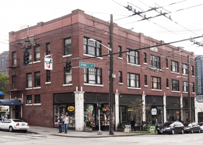
A unified expression between a building’s base and top was clearly not the primary goal for the designers of Pine Street’s Pinevue Apartments, making it a rarity among our heritage buildings. Next to the Melrose Building (home to Bauhaus), and threatened by the same re-development project, I would argue that architecturally the Pineview Apartments are just as significant, and just as worthy of preservation as is Melrose. Unlike the above mentioned typical Pike-Pine buildings, Pinevue presents us with a unique expression between lower and upper floors – an interesting merging of the expression of ground floor frame (commercial) and upper floor punched opening (residential). And though there are other buildings on the Hill that seek a strong distinction between base and top, none shows the same level of determination in differentiating their two uses as does the Pinevue.
The Pinevue Building
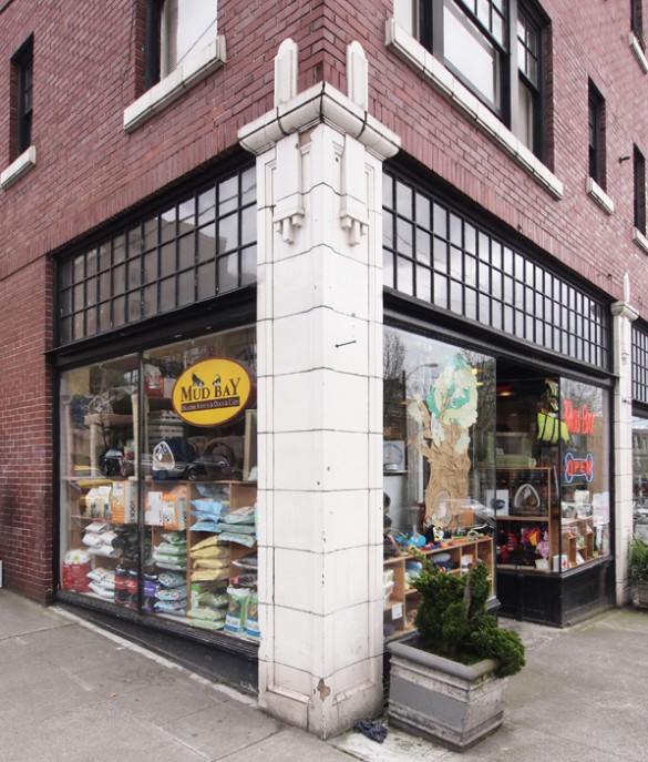
The Pinevue’s ground floor columns bear little resemblance to — or provide ordering for — the upper floors’ rather randomly spaced and grouped punched openings. This singular expression of the columns is furthered not only by the white of their terra-cotta but also by their framing the black painted storefront, not to mention being quite different than the dark red brick above. The fact that the columns are just slightly in front of (proud of) the brick is a wonderful detail that clearly punctuates the difference between base and top.
Pinevue Corner with Terr-Cotta Column
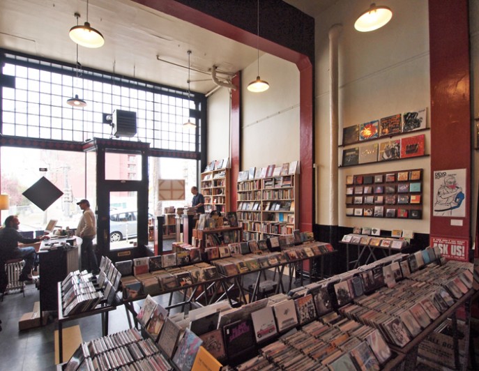
Retail Interior (Wall of Sound & Spine and Crown)
Despite these larger design moves that emphatically state the difference between commercial and residential uses, the Pinevue’s architects also looked to provide some unity to the upper and lower floors, but in a much more subtle way than one typically encounters along Pike-Pine, and in a way that did not conflict with the overall goal of programmatic differentiation. The small divided lights above the storefronts (especially handsome when seen from inside the retail spaces) are repeated on the residential windows above, whose terra-cotta sills are a match to the material of the columns below. Another nice detail that weaves together the entire Pine Street façade is the crenelations along the parapet that are of similar dimension – but different materiality – than the terra-cotta columns that they line up with below. This confident uniting of what on the larger canvas are disparate parts with the smallest of details reveals a level of sophistication and maturity by the Pinevue’s architects that make this building one of the Hill’s finest buildings (as well as presenting a lesson for restraint for us to treasure and advocate for).
Angled Storefront
The Pinevue’s intact original retail design leaves no question that it was built expressly for smaller tenants, tenants that it continues to successfully house to this day. The architectural clues are abundant, and include numerous doors framed by a rarely seen diagonally oriented storefront, complete with the requisite delicate corners. These angle storefronts have served the tenants well, as they provide greater visibility of their wares to passersby, and stand in contrast to the typical, larger, and planar storefront retail spaces along Pike-Pine. The Melrose Building also has it original storefronts intact, resulting in an entire block-frontage of intact heritage structures with no significant sign of alteration, speaking to the ability of this quality pair of buildings to continue to successfully attract retail tenants throughout their almost 100 year histories. A noteworthy achievement indeed.
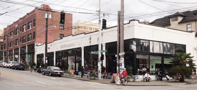
Melrose Building and Pinevue Building

