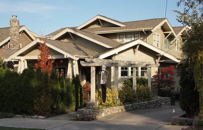
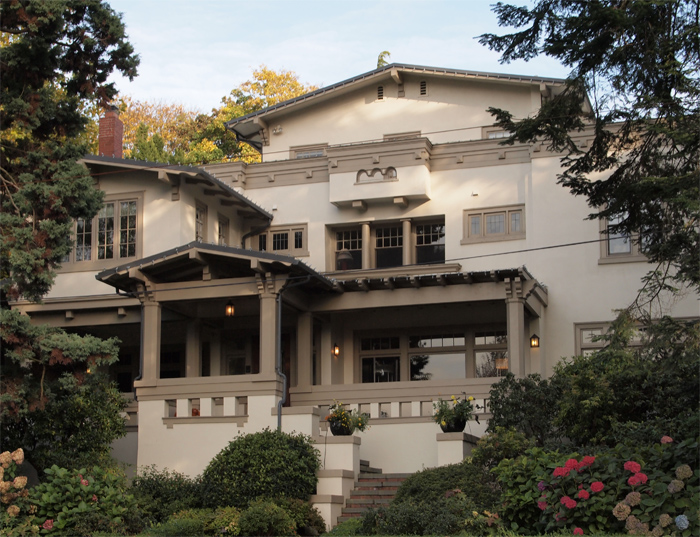
The ongoing debate on the Hill as to the value of conserving our so-called ‘character structures’ (buildings over 75 years-old) is heating up. It is fueled in part by recent development proposals that choose to incorporate (or not) such buildings into their project. Much of this debate — and the value placed by developers on preserving any particular character structure — centers on the merits of a building’s architecture and whether or not the building in question is great, or even good. All too often, however, such a focused valuation of building-as-object ignores the real value embodied in everyday buildings, and dismisses the contributions these buildings make to the urban fabric. Those who focus on building-as-object overlook how neighborhood character is defined as much by the ordinary buildings one encounters as by the extraordinary ones, especially when those of ordinary qualities comprise an assembly that weaves a complete, cohesive, and convivial urban fabric. While there are many impressive vintage structures on the Hill that deserve preservation outright — regardless of the surrounding urban fabric, such as the one at Pine and 11th pictured below, there are certainly many more buildings that actually contribute more to the character of Capitol Hill’s enviable streetscape, even if paling in comparison to our most beloved buildings as singular architectural objects, While a building’s particular architectural pedigree may be important, it is arguably more important to value the contribution a good collection of ordinary buildings makes in achieving neighborhood character.
11th and Pine, Capitol Hill
Pictured below are some traditional streetscapes that are an absolutely first rate, despite of (or perhaps because of) their being defined by average buildings. In these European examples, the adjacent streets inevitably lead to piazzas surrounded by architecturally magnificent secular and religious buildings that are the standard fare in that part of the world. Yet, it is a neighborhood full of streets just like those pictured below, defined by their average and ordinary buildings, that fosters the qualities which make these cities great. And it is ultimately this kind of street fabric that creates the quality spaces residents and visitors cherish just as much, and perhaps to a greater extent than, the grand buildings so often featured on the postcards we send back home.
Mantua, Italy
Bruges, Belgium
Back on Capitol Hill, let us suppose we have the same relative ratio of average buildings to grand buildings leading to a similar high quality built environment. With an understanding that the average does as much as the grand in creating our neighborhood character, there is no better representative assembly of such buildings on the Hill than those along 11th Avenue between Pike and Pine, pictured below. No individual building is particularly grand or distinguished, but taken together they form one of our great streetscapes. By paying attention to the cumulative effect created by such a collection of buildings, one is able see their value in establishing the kind of desirable character that many of us on the Hill cherish. Criticalto our current debate, this character is fully compatible with new development. Conserving our character structures while simultaneously building new structures is the kind of balanced development approach that will continue to inject fresh ideas into our built realm, while paying due deference to the urban qualities that attracted us here in the first place. To foster the positive outcome of a balanced development approach it is incumbent on members of the Capitol Hill community to effectively communicate to developers that they must take time to understand the value we place on a successful blending of both the old and the new structures.
11th Avenue, Capitol Hill
One relatively close by neighborhood that has achieved a very successful old-new balance on a neighborhood scale is Portland’s Pearl District. It took me some time to realize it, but it is the Pearl’s southern portion (where the character structures are, the northern portion was undeveloped rail yards) that is the most successful. The inclusion of both old and new is especially successful when the two are juxtaposed, as seen below. In this case, neither old nor new structures are exemplary as individual buildings, but taken together the streetscape they form achieves a balanced scale and creates a rich variety of experiences.
NW Glisan Street, Portland, OR
NW 11th Avenue, Portland, OR
Pursuing such a balanced development approach on the Hill presents one with several options. First, and as promised by the developer of the Bauhaus building site, there is a preservation strategy that includes the character structure’s original exterior design and the retention of its interior environment. New development would occur above and be visually distinct in appearance from the retained character structure. In the particular case of the Bauhaus development the approach is certainly laudable, supportable, and easy to imagine as both the exterior and interior of the Bauhaus and adjacent Pineview Apartments are clearly something special. In the case of the Bauhaus/Pineview, we have a building that is fairly distressed requiring considerable resources and a financial commitment from the developer. Beyond leveraging the ambiance (and good will) of our neighborhood, one major incentive in favor of preservation of the Bauhaus is, of course, the extra floor the developer is awarded as an incentive for its preservation. This incentive is the means that the developer needs to offset the added costs of preserving the buildings instead of tearing them down, and was conceived and shepherded by members of the community, and adopted by the City in 2009.
The Bauhaus Building, Pine and Melrose
Bauhaus Building Interior
In addition to the straight forward preservation approach of the Bauhaus, one could pursue to adaptively re-use a building by restoring it to take on new uses its original developers may never have considered. This option can be attractive if the building in question is, say, a diamond in the rough and not such an obvious preservation candidate as is the Bauhaus. One thing making this approach attractive on Capitol Hill is that we have many of the old Auto Row buildings, buildings originally designed to support automotive uses. Automobiles, being rather large and heavy, required extra-stout structures and open floor plans. The upside to this is that a robust structure and open plan provide the most flexible floor plan of all, one that is well suited to provide for the diverse demands for tenant space on Capitol Hill that include retail, office, and restaurant. In our debate on the value of maintaining the granular streetscapes through preservation of the average and every day, goals for preservation certainly should include such Auto Row buildings as the Davis-Hoffman, pictured below. Davis-Hoffman is is a perfect candidate for conservation efforts, the extent of which are being discussed by members of the Capitol Hill community and the property's developer, and whose latest design fully integrates the Davis Hoffman and the adjacent Madison Park Greetings buildings into the project.
Davis Hoffman, Original Condition (Puget Sound Archives)
Davis Hoffman, Current Condition
Removing the layers of previous renovations would reveal that in its former life the Davis Hoffman was a much more handsome building than it is today, and, more importantly, has those average qualities that contribute to extraordinary streetscapes. Even today it has porosity — courtesy of a substantial collection of large windows — that distinguishes it from contemporary developments. Paired with the two adjacent Madison Park Greetings buildings around the corner (and part of the same proposed development), the Davis Hoffman creates the type of continuous street fabric that has made neighborhoods such as the Pearl District a great success, and holds great promise for ours. Fortunately, on Capitol Hill one needs not imagine the potential outcome of such conservation efforts, for we have many fine examples of adaptive re-use projects. Thanks to such forward thinking developers as Hunter’s Capital, Dunn and Hobbs, and Madrona Real Estate Services — to name but a few — we have not only the architectural proof of the viability of such a strategy (while often times starting with buildings in much greater distress than is Davis Hoffman), but of its financial merits as well. And this group of local developers is willing to share their experiences with others seeking to achieve similar results by in their own development projects.
Elliott Bay Book Company, Prior to Renovation (Image Michael Oaksmith)
Elliott Bay Book Company, Post Renovation
When Elliott Bay Book Company relocated from Pioneer Square, it was a significant victory for Capitol Hill. It was no easy achievement as its previous location in the Pioneer Square Historic District defined the character of the bookstore as much as the thoughtfully chosen volumes that graced its shelves. Such character was important to the book store owner, and was a prime driver during his search for a new space. Thanks to the adaptive restoration of the flexible Auto Row typology from automotive service to bookstore, we have a fine retail space whose character and authenticity is preserved. In addition to the code-required seismic upgrade, restoration strategies included restoring the wood trusses and skylights, which had been roofed over. On the facade, a historically accurate new window system was installed. This was done in addition to the more typical new bathrooms, modern telecommunications, lighting, and heating/cooling system upgrades. A fairly involved process, but with results that have created one of the best retail environments in all of Seattle. Yet the developer, Hunters Capital, could have easily demolished the building, and started afresh with a 6 story edifice. Besides a passion for old buildings, Hunter’s has found that such spaces create desirable and profitable retail spaces, which have a unique ability to attract discerning local retailers such as Elliott Bay Books.
Elliott Bay Book Company, Interior Prior to Renovation (Image Michael Oaksmith)
Elliott Bay Book Company, Post Renovation
In addition to the above success story, there is another project that perhaps required even greater vision and fortitude: taking the building pictured below and realizing what has become a model for small, local retail, and adaptive re-use projects — the nationally acclaimed Melrose Market. Quite frankly, it is hard to imagine anyone seeing the value in its pre-restoration condition. But someone did, and thanks to developers Dunn and Hobbes and Eagle Rock Ventures, we have a project that has literally re-defined the western edge of Pike Pine. What was formerly a forgettable street has been transformed into what many see as becoming one of Capitol Hill’s fines. It provides the foundation for a great streetscape being embraced by current and future development projects such as the above mentioned Bauhaus project whose conservation efforts were inspired by those of Melrose Market.
Melrose Market, Prior to Renovation (Image Liz Dunn)
Melrose Market, Post Renovation
Melrose Market Interior, Post Renovation
Melrose Market is another good reminder (similar to Elliott Bay) that the conservation of the interior environment elicits as much consideration as the outside. Another former Auto Row building, Melrose Market has long spanning trusses that prove to be well adapted to re-purposing. At Elliot Bay, which has a similar structure, the space provided is for one large retailer whereas at Melrose Market space provided is for almost a dozen, revealing the beauty and utility of the auto-row typology. In both cases the success of the project involved more than removing layers of paint, repairing rot, and bringing the building up to current standards of health and safety. Thoughtful tenanting of the spaces was essential, and to my mind, the successful results were almost a forgone conclusion. Larger national chains, with their standards of vending and for spaces they feel optimize the separation of shoppers from their money may not look twice at Melrose as it doesn’t fit within their conceptions of a successful retail environment. Yet, Elliott Bay Book Company and Melrose Market are of a culture that appreciates the unique qualities possessed by character structures, making the conservation of such spaces as appealing in attracting the types of businesses we desire on the Hill as are the spaces themselves. In a broader context, conserving our heritage buildings is one of the best a means we have in providing the type of spaces that locally-bases businesses crave, and many of us want to support.
Agnes Loft, Terrace Between Old and New Structures
Both old and new buildings are needed to create a cohesive urban fabric, and it is starting to emerge on small patches of Capitol Hill. New, modern buildings, with their clean lines and transparency are to be expected — and are most welcome — as they fill in parking lots, gas stations, and vacant lots. However, we must not neglect those portions of our neighborhood where frontages of character buildings exist and ask developers to thoughtfully incorporate them into new developments while there still is an opportunity to do so. There should be little debate that such a conservation strategy is critical not only to maintaining the neighborhood identity many of us cherish, but to providing the kind of spaces others of like mind are looking for when searching for a new place to call home.


