Courtyard housing is one of the oldest types of housing — whether for individual or multiple families — and dates back to at least ancient Greek times. It has such a lengthy heritage for several reasons, including interior cross ventilation and increased access to daylight. Outdoors, there is the ability to achieve a well-defined (and defended) space, which can be completely enclosed or open. Capitol Hill has its own assortment of courtyard housing, the majority most likely built before the 1970s with the Anhalts, dating to the 1920s, as the most famous example. As to the reasons for courtyards falling out of fashion I can only speculate, but maximizing return on investment must be one of them, as providing large planted landscapes not only lessens the number of units per parcel but also increases operational costs. Whatever the reasons, it is unfortunate fewer of them are being built.
[caption id="attachment_2102" align="aligncenter" width="720" caption="Boylston Court view of Courtyard from Street"]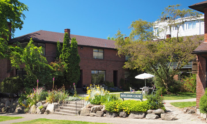 [/caption]
I have a couple of favorite courtyard housing projects on the Hill, including Boylston Court, a nicely complex project just west of Seattle Central Community College, and the subject of this posting. Boylston Court has several noteworthy qualities, including a lushly planted and well maintained landscape, a south facing courtyard, and – my favorite aspect — an astonishing variety of design and detail in a compact footprint. Taken individually, the parts of Boylston Court are nothing outstanding; rather, it is in their successful assemblage that an exemplary building is found.
[caption id="attachment_2103" align="aligncenter" width="720" caption="Boylston Court view of Garages Along Olive"]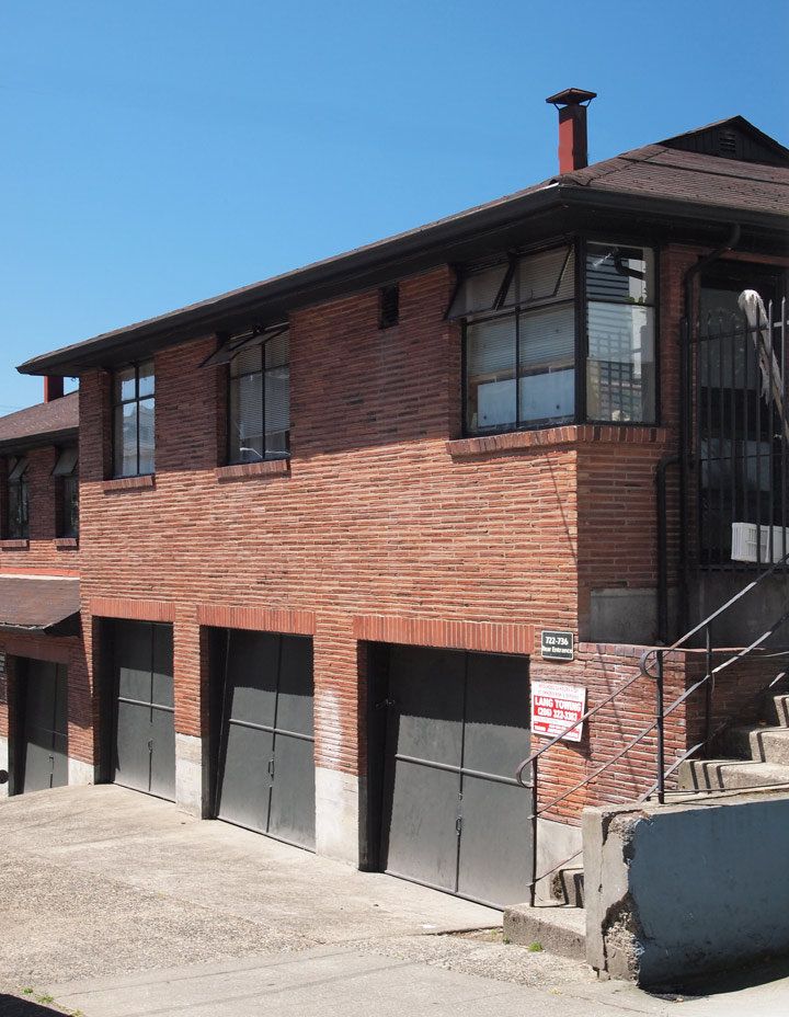 [/caption]
Most likely built in the 1950s, it has many elements of that era. including roman brick and steel framed windows. I know I am not alone when I write that I am a sucker for steel-framed corner widows. And who wouldn’t be? They occur in several locations at Boylston Court, at both prominent, and well, less prominent, locations (such as this one at the above garage). But ooh, what beauties they are, regardless of location. It is a shame that steel windows today are (incredibly) expensive, making them prohibitive for most projects — a reason for us to treasure and preserve the few remaining ones we have. Other details include the most minimal of handrails (as seen in the above photo) — similar to the steel windows there is nothing there but the minimum needed for support. Too bad such delicacy is not allowed by code anymore . . .
[caption id="attachment_2104" align="aligncenter" width="730" caption="Boylston Court Southwest Corner of Courtyard at Olive"]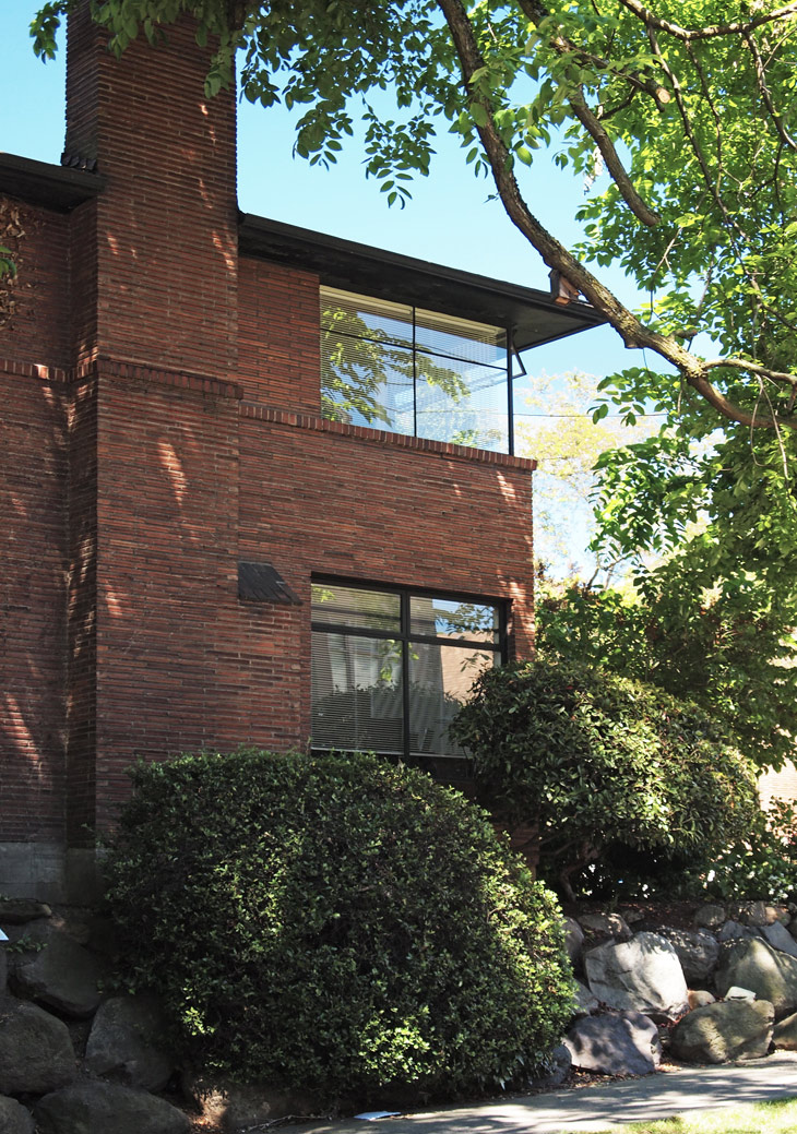 [/caption]
Opposite the courtyard from the above garage photo is another beloved steel-framed corner window, this time with the roof seemingly floating above it. I pray the owners never swap them out for vinyl windows (it does happen). Note how the foreground gives a hint of the courtyard landscape contained beyond.
[caption id="attachment_2105" align="aligncenter" width="720" caption="Boylston Court view of Eastern Building from Olive"] [/caption]
Above is an alternate view of the garage facade in the second image. Just beyond Boylston Court is an even older apartment building (in blue). Compared to the box that is its neighbor (and mind you, I do fancy boxes) Boyslton Court’s facade and massing falls with the grade. This not only creates a better pedestrian environment (garage doors not withstanding), but also creates a break in the mass of the building at both the roofline and the plane of the facade. Here is a break down in massing (that Holy Grail of design review boards) that is actually understandable and ties back to something tangible. What a refreshing departure from the current modulation craze that seems to have neither rhyme nor reason, other than a designer’s whimsy.
[caption id="attachment_2106" align="aligncenter" width="720" caption="Garages and Decks along Boylston Avenue"]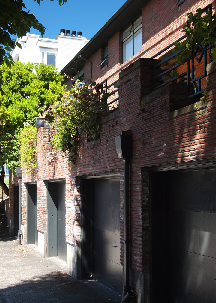 [/caption]
[caption id="attachment_2107" align="aligncenter" width="720" caption="Facade Along Boylston with Varandah Above"]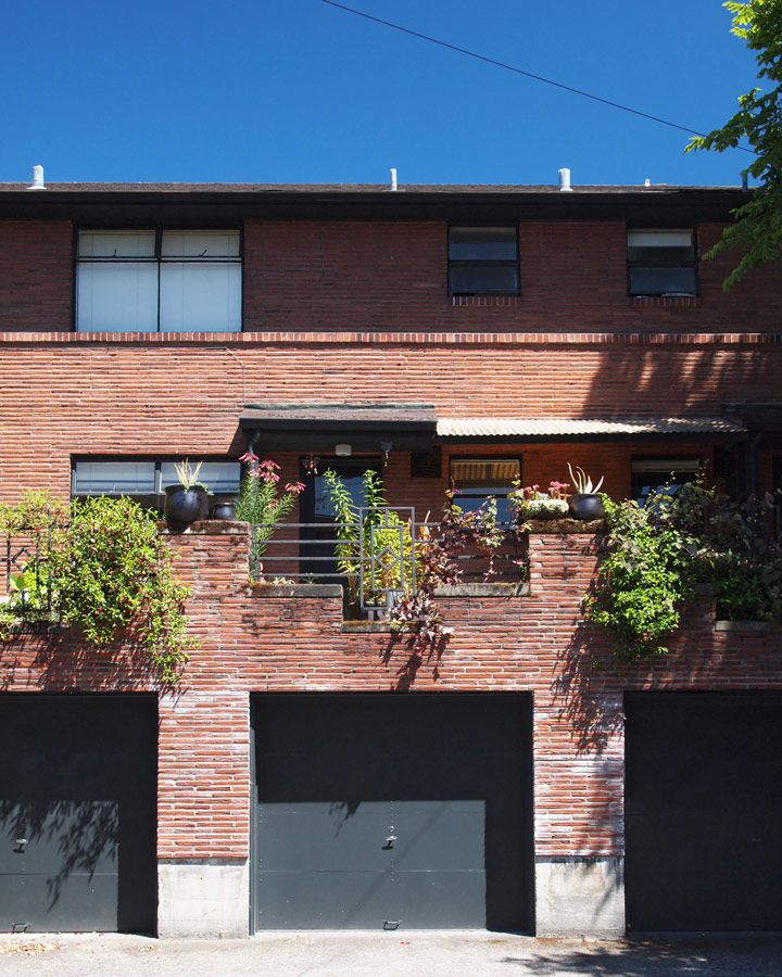 [/caption]
The other street elevation of Boylston Court occurs, appropriately enough, along Boylston Avenue, where the designer created one of the better apartment facades on Capitol Hill although it is (again) dominated by garage doors for a section of its length. Despite this apparent handicap (or because of it?), over the garages there is a nice and spacious verandah on the level above the garage, whose size makes it appear to actually be quite usable. Being this close to the street a nice venue is offered for the residents and passing public to informally engage with one another (or not). Here, the garages are effectively used as a base, an intermediary that helps to maintain protocols. The garages also provide modulation (that again is understandable) to the verandahs, and order the various levels of transparency of the facade as it transitions from brick to metal railing and back to brick. Classic.
[caption id="attachment_2108" align="aligncenter" width="720" caption="Boylston Court End Unit with Private Entry"]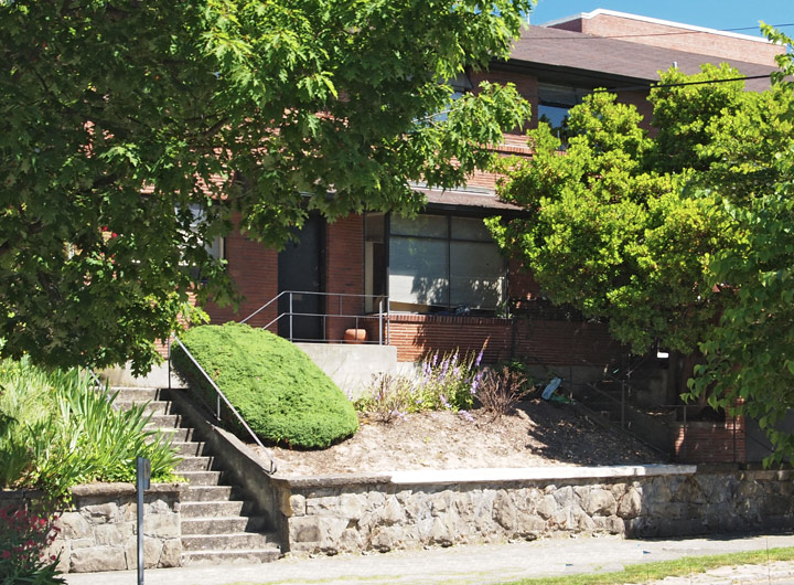 [/caption]
Further north along Boylston is still another expression, this time more of a townhouse or even a single family home. Making a return appearance is the delicate guardrail from along Olive and the much-loved corner window. This unit even gets a bit of a front yard and entry porch, in place of a verandah, as well as its own set of stairs. Despite this entry being the fourth (fifth?) design treatment of the street frontage of the modestly sized project, the complex’s over-all architectural unity remains in tact. This is an extremely delicate balance to maintain, especially with so little street frontage. To have all of these parts flow cohesively is not something to take for granted, as each section can simultaneously stand on its own merit while still contributing to the greater whole; however, it is not just the buildings that play a role. The landscape’s design is equally important, be it the built landscape of the verandahs, the micro, intimate front yard noted above, or the the courtyard, pictured below.
[caption id="attachment_2109" align="aligncenter" width="720" caption="Boylston Court Inner Courtyards"]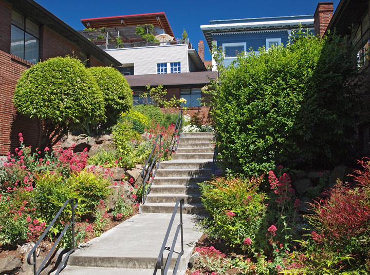 [/caption]
Instead of digging a large hole, and filling it with building (a typical approach), the designers of Boylston Court approached the site differently, leading to the above-mentioned qualities. Where this approach really bears fruit is in the courtyards. In addition to the large, central courtyard depicted above, there are two alley-sized-courtyards that wind their way up the site, to the east and then north, creating a splendid terracing and layering of space effectively creating shared landscapes that are at the same time intimate. A well resolved dichotomy.
[caption id="attachment_2110" align="aligncenter" width="720" caption="Courtyard Facade with Wood Siding"]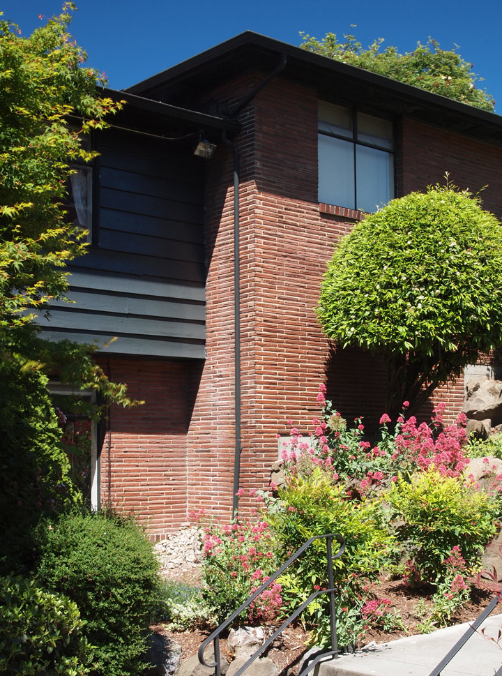 [/caption]
Above, one sees the only significant break in the otherwise uniform palette of roman brick — rough sawn cedar siding (a fuller extent can be seen the first photo); curious, that this change is somewhat buried in the courtyard, and not on the street, where it would be more ‘expressive’. Or is it? I like to think it yet another example of the designer’s sophisticated approach. Whisper, don’t scream. Also, the wood siding is a softer material than the brick, and in the designer’s eye more apropos to be within the softer courtyard, the softer landscape.
Boylston Court is a great building in our neighborhood, and a great example of how a context driven design (be that the site or the content of the building’s program) can provide a wealth of valuable clues about which to design, and lead to a building that not only fits well into its context, but enhances and creates its own. It is also a superb example of courtyard housing, and a building typology I would like to see more of on the Hill (albeit, at a greater density).
