Early modernists designers were not gripped by the fear of using brick, as were many later practitioners. With an emphasis on the new, the factory assembled, and the lightweight, early moderns had many reasons to eschew brick: it was traditional, it was heavy (relative to newer materials such as steel and aluminum), and its appearance was fully embraced by society. Brick was hardly capable of eliciting the wonder and novelty of the new that many of the then avant-garde architects craved. Though I have some sympathies with their reasoning, omitting such a useful material on ideological grounds is not compelling enough to overshadow its many positive attributes, including those of economy, durability, and scale. Looking back far enough, say to the first quarter of the 20thCentury, one finds that brick did make an occasional appearance in modernist design, proving that the goals of cubic mass, simple form, and restraint of ornament were still possible in these brick clad anomalies. These outliers may have come to be because the newer materials architects really wanted to use were not yet readily available nor understood by builders. Mies, the main harbinger of glass and steel, frequently used brick prior to the 1930s, but even such examples are rare (Frank Lloyd Wright is a notable exception). The Lange House, one of Mies’s brick houses, built in 1930. While the brick could have easily been covered in stucco -- making it more abstract and purer of form -- to my eye the brick takes little away from the cubic massing and clean lines. The cleanly detailed brick, along with expansive ribbon windows and an aggressively cantilevered entry canopy leave little room for debate that this is a modernist building. Nevertheless, such well executed buildings did not propagate a confidence that brick was suitable in achieving a modernist aesthetic, its qualities being overlooked in favor of more contemporary and non-traditional materials.
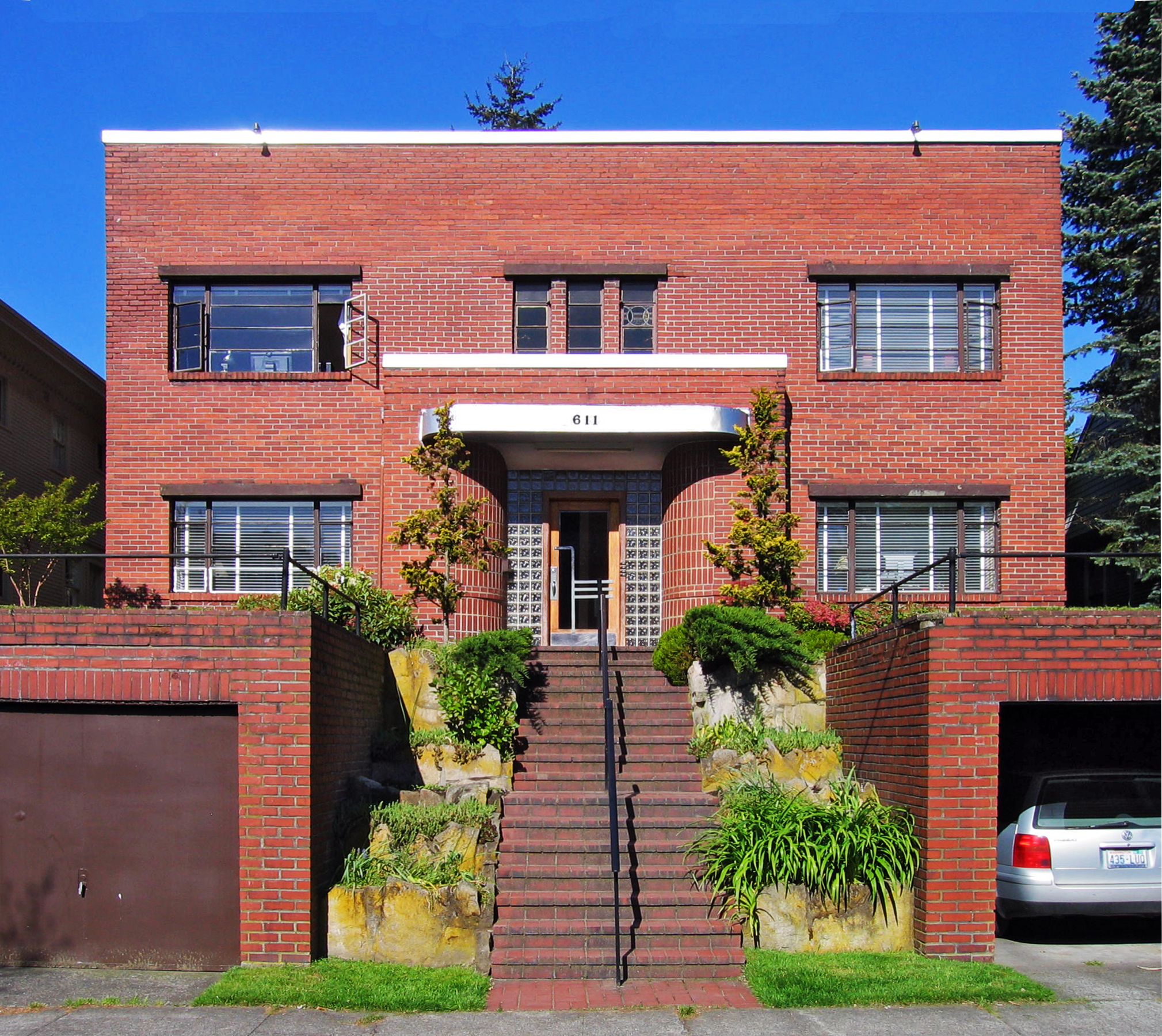
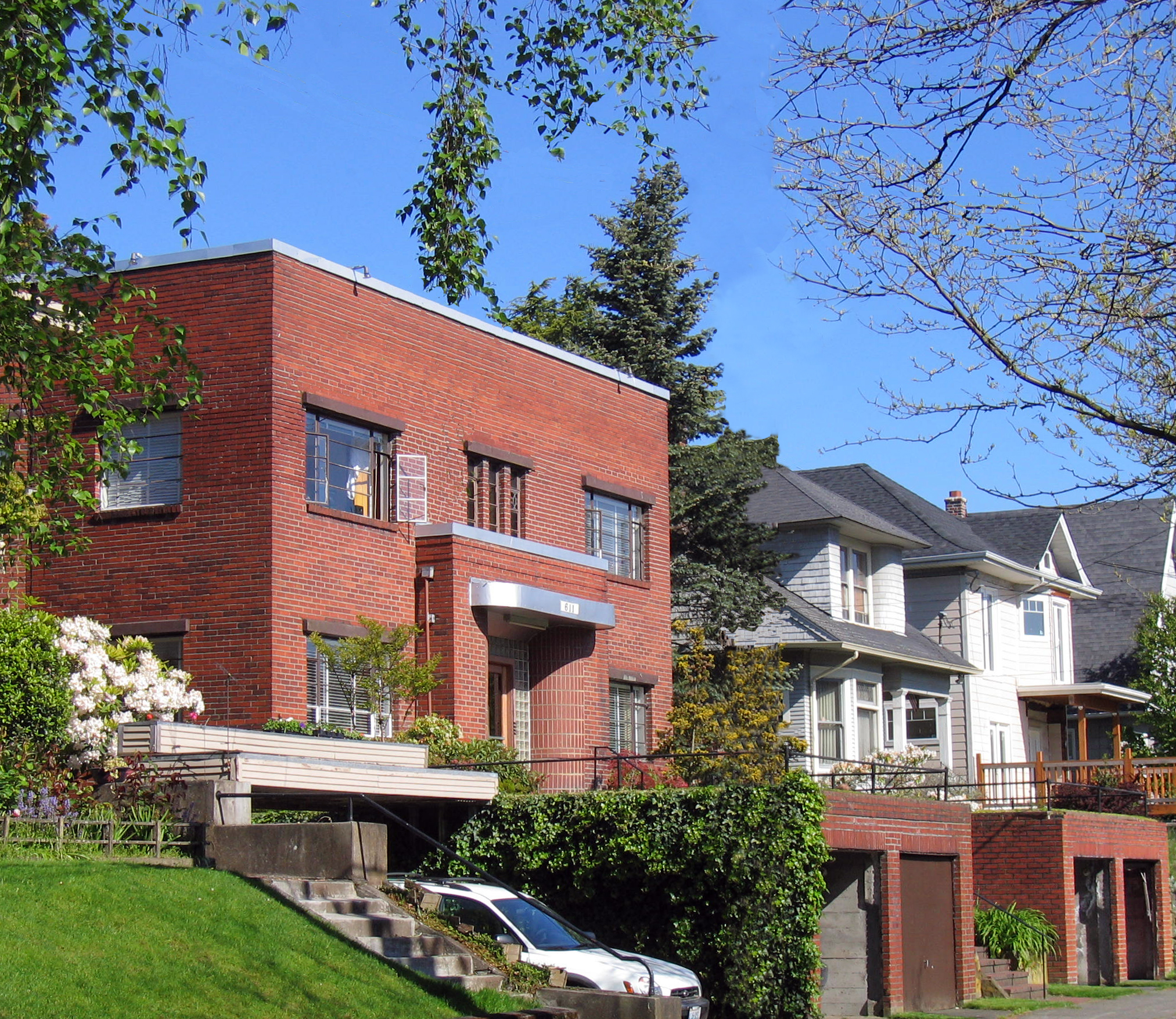
Malden Avenue East -- a favorite Capitol Hill street -- has one of our best early modernist buildings that not only embraces brick in the tradition of the Lange house, but also shows that its author had no qualms as to its appropriateness in expressing their design intentions. Furthermore, the diminutive number 611 combines the above early 20th Century aesthetic with another equally short-lived, early favorite -- art deco -- an unsung hero of early modern design. Especially exciting about 611 is that (according to King County records), it was built in 1907, making it one of Seattle very early modern buildings, and is step with goings on in other major cities.
While it may be a bit of a push to make much out of cubic massing in such a small building (there is little room to do anything else but), its squareness of presentation nevertheless toes the party line of early modernism, and is punctuated by the squat box that forms the entry vestibule. The building's dual heritage of early modernism and deco is further revealed at the vestibule, where a gently curving, shiny aluminum (or painted to look aluminum) canopy furthers the deco association. Other delightful touches at the vestibule include bricks forming another curve, leading to a deco inspired door surrounded by glass block (one of modernism's most misused materials, but used quite well here). Although lacking the horizontality that the windows that the Lange House displays, those on 611 have a pleasing horizontal proportion to them (kudos to the building's owner for keeping them intact).
Flanking the entry stair are a pair of garages that are as well-integrated into a project as you will see on the Hill, and whose function in the project exceeds the mere utility of parking cars by not only framing the entry steps but also by extending the useful size of the front lawn. Also done in brick, the garage masses give the small building a greater heft. The pipe rails, lacking the inner rails required by current codes, are a nice foil to the garages' mass, and would do Mies proud. While strong in their attitude to the street, the garages fit in perfectly with the overall building-landscape approach, stepping down to the sidewalk in a flowing transition of building, turf, garage, and sidewalk.
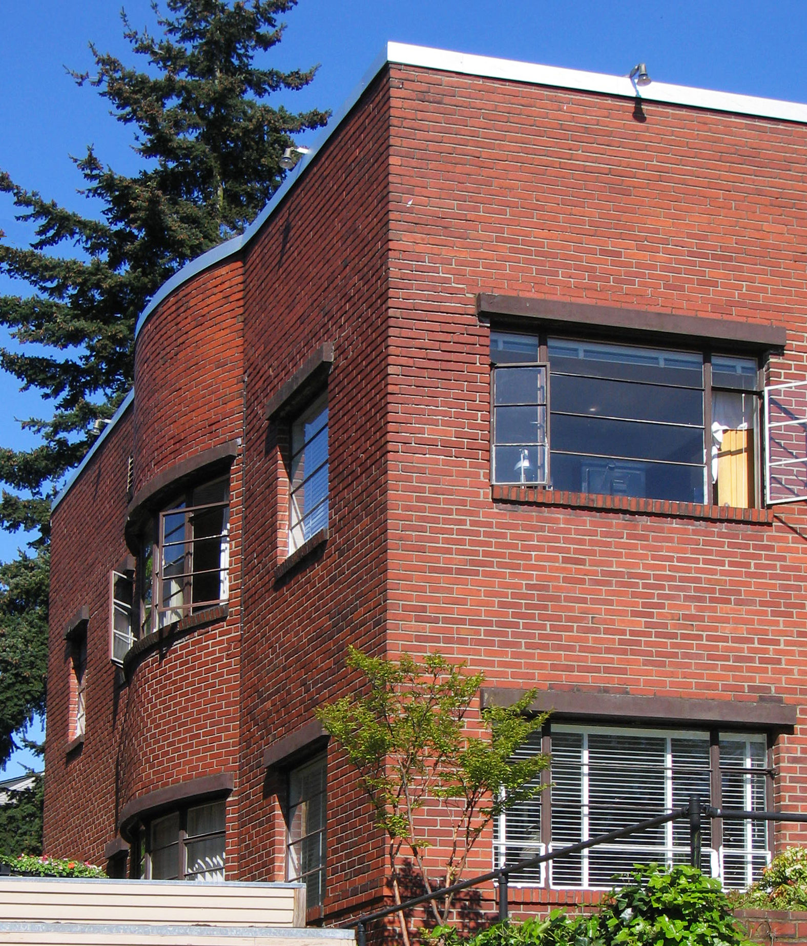
Not all is serious at 611, yet all has its place. The north and south elevations are a bit more relaxed than the rigors of the front, where the mass of brick is pushed out midsection by another gently curving wall, this time on both floors. Not on the front, mind you, where it would be more ‘expressive’, but on the sides, and partially hidden from the street. Perhaps the curved walls ended up on the sides because the interior space dictated their placement, where they may have the greatest benefit to those inside the building; certainly a more important consideration than to those passing by on Malden. Perhaps the architect of this modest yet excellent little building had the confidence and conviction of a seasoned hand, knowing that a little lapse in the rigor of the box -- especially if veiled from one's glance -- would not detract from the nobility of the whole, and felt compelled to be discrete by keeping the curved walls on the side elevations, maintaining the modest street frontage. Perhaps this same perceived modesty kept the architect from making the curved wall out of another material, even another pattern of brick? If my speculations ring true, 611 presents a lesson in modesty from which most of my architect-collegues would benefit.


