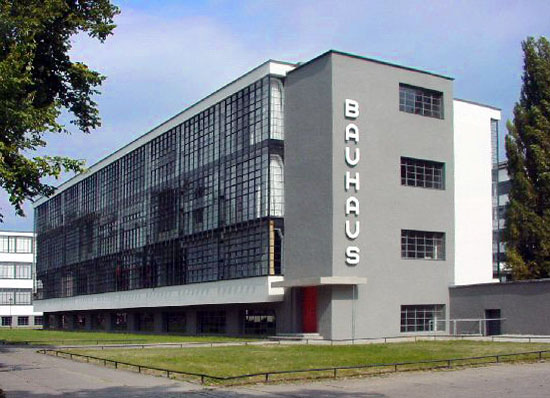
As well as being the name of Capitol Hill’s premier coffee house and a 1980s Goth band, Bauhaus was the name of the modern movement in architecture’s most famous design school. Perhaps the most famous, ever. The only competition for such a superlative may be for the École des Beaux-Arts, the Parisian school that is most (in)famous for its pedagogy of classical architecture, and whose pre-immanence was in fact eclipsed once the Bauhaus came into being in the early 20th Century. The Bauhaus was justly famous as a school for painting, sculptor, dance, graphic design, but it was in the field of architecture that its legacy was — and is — strongest. Modernist icons such as Mies and Gropius both lead and taught at the institution, and both followed with highly successful and influential professional careers after the Bauhaus was disbanded by the Nazis prior to World War II. The design pedagogy taught resulted in some of the 20th Century’s best buildings, including that of the school itself, designed by Gropius and pictured below.
[caption id="attachment_2113" align="aligncenter" width="550" caption="The Bauhaus (Source: Wikipedia)"] [/caption]
It would be hard to underestimate the influence the Bauhaus had on design schools in the United States. After its closing many instructors came here to continue their teaching careers and professional practice. Gropius landed and Harvard, while Mies ended up at the Illinois Institute of Technology in Chicago. Even tiny Black Mountain College (no longer extant) in the mountains of North Carolina landed some Bauhaus alums. The design approach taught was, in its time, at the cutting edge. So cutting edge, in fact, that it was initially a design approach typically found only in larger cities or for larger clients or more prestigious buildings. That was of course bound to change with time, but smaller markets (as Seattle at the time) were longer to embrace the Bauhaus aesthetic, especially for smaller, developer driven buildings. Education also had an influence on the Bauhaus’s dissemination into the U.S., as the Beaux-Arts tradition was what was taught at the vast majority of our universities well into the 1930s, and most likely at the U of Washington as well.
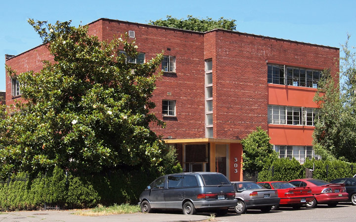
[caption id="attachment_2114" align="aligncenter" width="720" caption="303 Harvard Avenue E Corner View"] [/caption]
And though perhaps a bit slower to arrive at the modernists dance, Seattle’s Capitol Hill is fortunate to have several Bauhaus/International Style (similar time period and aesthetic) influenced apartments of various sizes, including the mid-sized beauty pictured above, built in 1949. Thirty years elapsed between the construction of the Bauhaus and 303 Harvard Ave E, perhaps enough time for a direct connection to be tenuous; however, the lineage is evident. Cubic massing, concentrated and expansive use of glass (with an emphasis on horizontals juxtaposed by verticals), and something missing form today’s Bauhaus prodigy: the crisp delineation of the depth between the buildings mass (in this case brick) verses its openings.
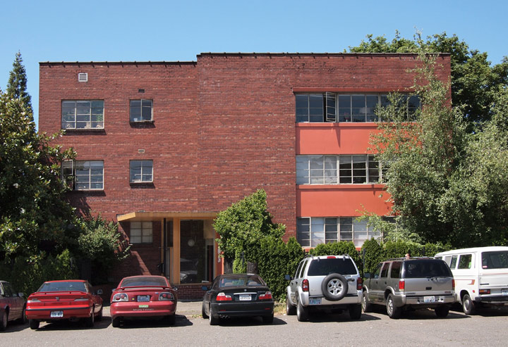
[caption id="attachment_2115" align="aligncenter" width="720" caption="303 Harvard East Elevation"] [/caption]
Similar to the recently profiled Boylston Court, 303 has the beloved steel window, whose effectiveness as a design element is enhanced by it being framed by the more massive feel of the brick, as well as the little horizontal projections at the window heads and sills. No corner windows here, alas, but the modernist,s next favorite trick — that of the continuous ribbon window — and here deftly used in combination with concrete spandrels on the building’s most significant facade. Nice!
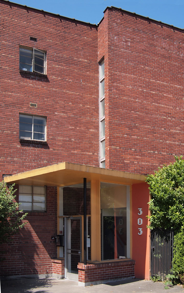
[caption id="attachment_2116" align="aligncenter" width="720" caption="303 Harvard Entrance"] [/caption]
Even the addressing numbers have the same proto-super graphic and vertical arrangement as the Bauhaus, this time with an art-deco font. The concrete entry canopy continues the thin lines above the windows in the body of the building, and is at a bit skewed from the mass of the rest of the building. No steel frames here, the window glass is framed directly into the concrete structure, lending it further distinction from the rest of the building. Especially nice is the re-entrant corner and the lone steel post. It would be nice to have a look at the interiors of the units, hopeful that they still may have some great space-age appliances and fixtures.
There are at least several other buildings of this ilk on the Hill, three of which I documented in this pamphlet: Capitol Hill Building Analysis . Each one unique, and each one worthy of providing precedent to future design projects on the Hill — all to better balance the prevalent and suffocating post-modern pastiche that is all too often referenced in the majority of our current development.
