I have been riding my bicycle past the Harrison Modern for almost a decade now, always appreciative of its design and one that I have been yearning to share for some time. Unfortunately, its predominant exposure faces north, making its photography less than ideal for a majority of the year and thus potentially depriving the building the adoration it so deserves. Imagine my great joy when, a couple of weeks back, I was walking past in the late afternoon -- camera in hand -- with the lighting just perfect for portraying the Harrison's many charms.
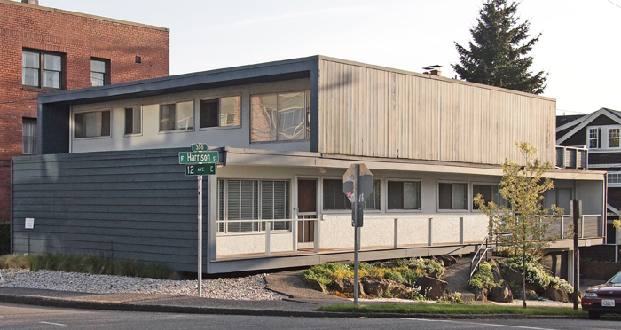
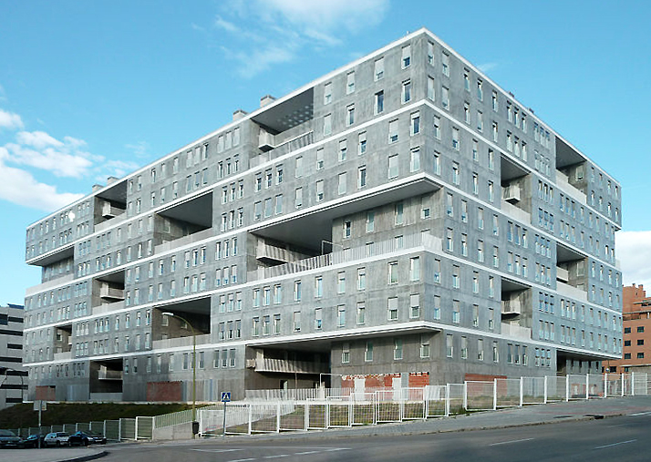
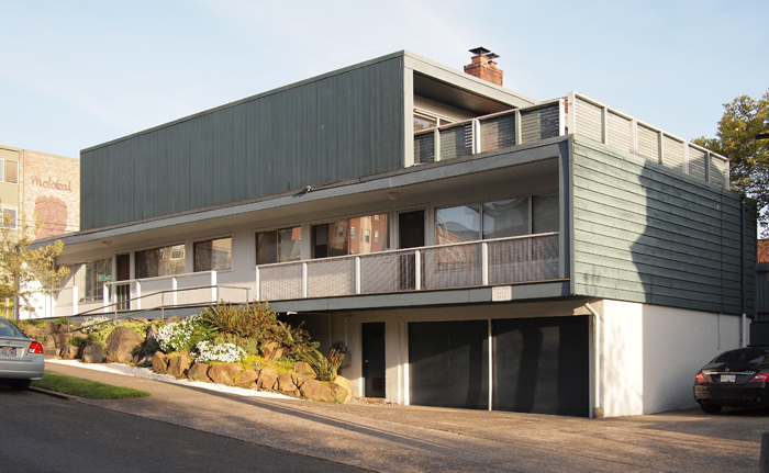
Located at the intersection of 12th and Harrison, the Harrison Modern is clearly a building whose designers were firmly rooted in mid-century modernism. Built in 1951 and designed by Victor Martin, the Harrison is not only exemplary of that era, but it also foreshadows current trends in architectural design in its use of layered cubic forms as exemplified by the work of such contemporary Dutch architects as MVRDV in the Edificio Celosía, pictured below. This stacking design approach, though all the rage now, was most certainly pretty avant-garde over 60 years ago, and continues to mark the Harrison unique among Capitol Hill's vintage buildings.
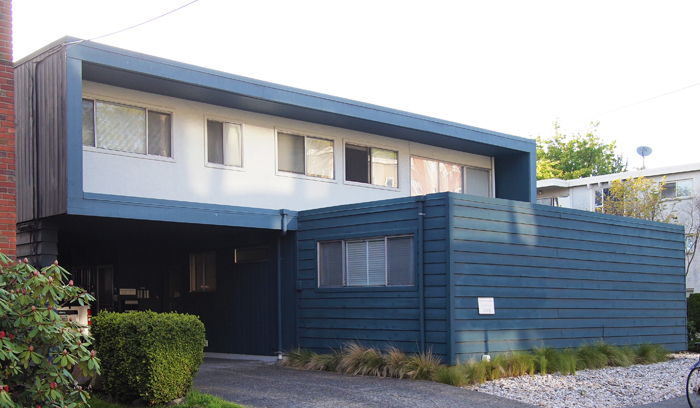
What I am calling a stacked or layered design is one where each floor (or grouped floors) is expressed individually and in a very like manner, without the more traditional base, middle, and top. In both the Harrison and MVRDV example, this stacking is expressed not only by revealing the floor lines, but also by carving out voids for balconies that emphasize the volume of the floors above or below. The Harrison's design captures this layered design approach to create cleverly framed outdoor spaces that exhibit the modernist desire forblending indoor and outdoor space, including a generous upper floor balcony that must provide a great view of the Puget Sound and Olympic Mountains. On a more intimate scale, the north facing veranda of the Harrison is crisply framed, forming a powerfully simple, elegant, and dignified facade along Harrison Street.
Along 12th Avenue, the busier of the two streets upon which the Harrison is sited, a more formal facade was in order and is fittingly more massive in temperament. The contrast, and utility between, these three elevations is achieved by the simple rotating of the lower and upper floors to best suite their orientation, an ease of effort to effect that has long captivated me. A powerful difference is accorded between the two floors; on the longer, northern elevation is the lower form which represents the void, and on shorter, eastern elevation, it is the upper form. A lower floor ying to the upper floor yang, as it were.
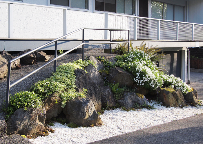
Contrasting the bold cubic forms above are the cascading stones and plantings that mark the entry ramp into the building. While on one level apparently quite different form the building's aesthetic, this little bit of landscape is actually within the spirit of its mid-century heritage, and provides a finishing touch to one of Capitol Hill's finest small buildings. If I squint a bit, I can imagine the Harrison at home in say, Palm Springs or Malibu, but am quite content knowing it is our neighborhood.

