Design Thoughts

Capitol Hill’s Alley Landscapes, Planned or Otherwise

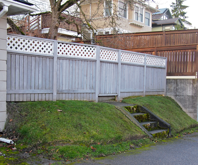
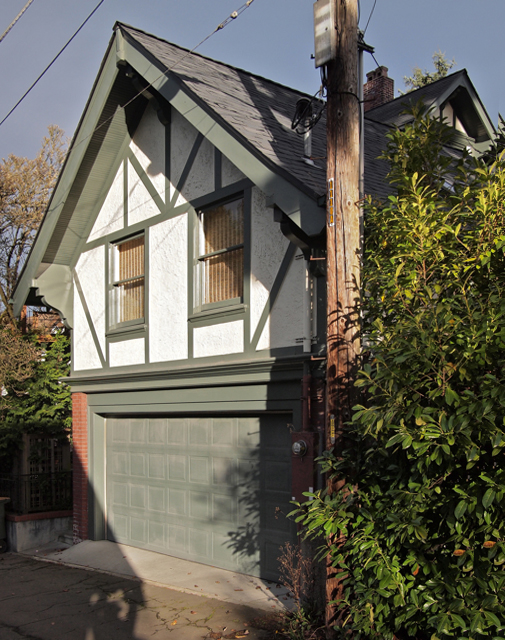
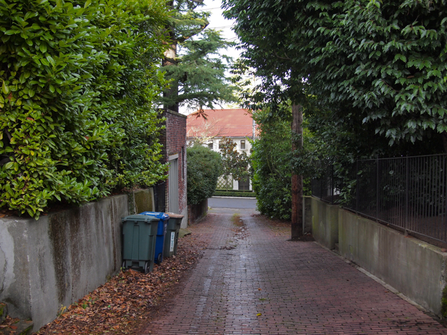
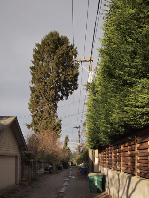
Alleys have a certain alluring, intimate quality to them, owing to their lesser width and traffic as well as their less intentional nature. Typically associated with the denser, more urban parts of a city, Seattle has an extensive network of alleys not only in its downtown but also in many of its residential neighborhoods, including Capitol Hill. Close-by Portland, by comparison, has only one sizable neighborhood with alleys, Ladd's Addition. Here on Capitol Hill, we not only have alleys, but alleys forming a network that is extensive and diverse, presenting fertile ground for the urban explorer.  In fact, the network is so diverse that today's is the first of several posts on the topic -- and all on alleys in only one corner of the Hill: east of 15th, west of 22nd, north of Thomas, and south of Galer.

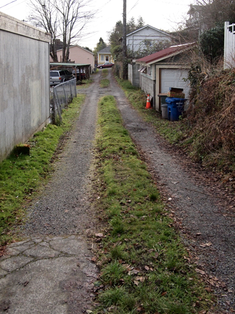
First and foremost, alleys are about service, and are the home of utility poles, recycling bins, garages, and other sundries that allow us to not only efficiently run our lives but to do so in a manner that keeps streets presentable and less cluttered. This prescribed, service role occurs within a variety of landscapes, ranging from compacted gravel roads -- more akin to a country lane than an urban way -- to alley landscapes that are meticulously cared for and brick-paved. While any given street landscape may possess such variety, the alley landscapes depicted here possess it within a more compact range -- and sometimes only within a single block -- oftentimes belying the apparent uniformity presented by the associated street frontages.

Some alley landscapes differ little from street landscapes: a manicured lawn, fence for privacy, a flight of steps; rubbish bins and vehicles tucked within a garage and out of view. Other alley landscapes lack any apparent order, with life’s detritus arrayed in full view.When structures are present, they are may be reflections of those of their street-counterpart, being made of the same materials and details, and of similar proportion and form. Oftentimes, such alley-structures occur within lush landscapes one expects of the best cared for gardens, enveloping the alley. In such instances, the building-landscape combination creates a spatial intimacy unrivaled on Capitol Hill.


In addition to providing functional space on the alley, Capitol Hill’s alleys provide functional space above the alley, as witnessed by the many pruned trees, which allow for utility lines to pass unimpeded. Rough in execution and unsatisfactory in appearance, if there were no alleys to host utility lines, our robust, heatlhy, and prevalent street trees would be shorter and less healthy, yielding to the pruners of utility providers.

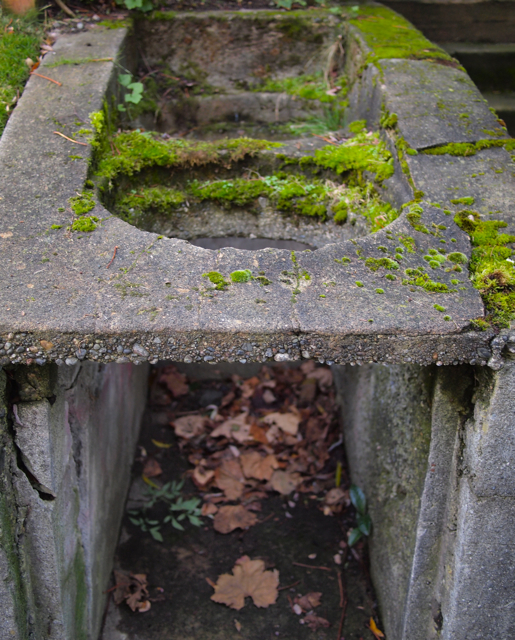
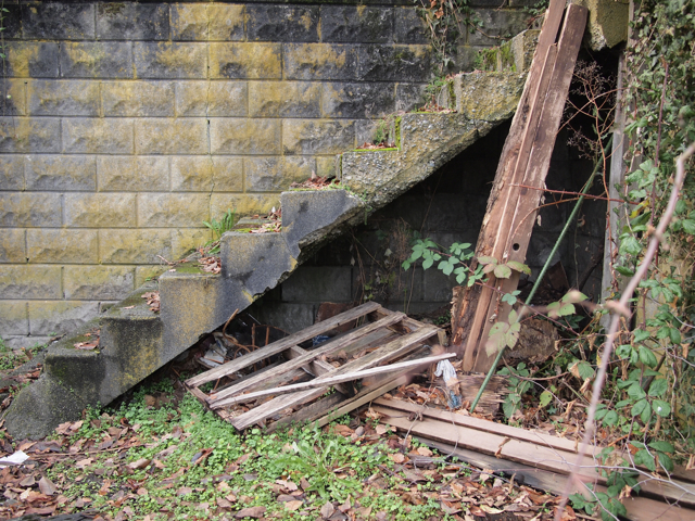
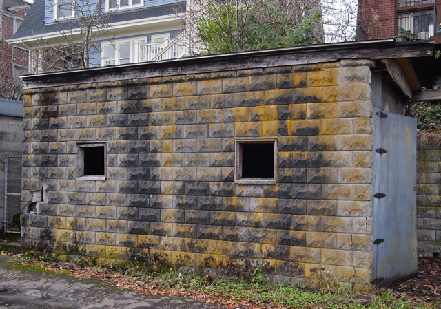
Landscape, however, is not always what yields. Left unchecked, many of the elements within the alley yield to landscape, their useful life expired. Once amenities to homeowners, such artifacts provide a narrative to the way we conducted our everyday lives. Even without the moss and decaying concrete, built objects in the alley inherently have a landscape quality to them; or, a primacy and unassuming beauty that blurs the distinction between natural and constructed. Much as one may consider a rural landscape scenic for its teetering barns, coops, and sagging fences, the evolution of built alley into landscape furthers romantic sentiments.

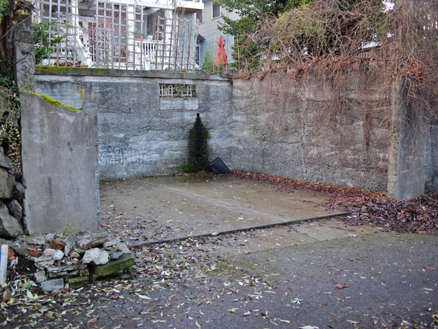
This reclaiming of the built by the landscape is not limited to smaller utilitarian objects. Walls, stairs, and even entire buildings can be seen in various phases of reclamation. Without the societal scrutiny that streets receive, and even in this affluent section of Capitol Hill, such reclamation is common and not unexpected within the alley environment.

Once the landscape has taken hold, constant attention is warranted to fend off its tireless advances. Attention that a homeowner typically exercises -- with greater societal relevance and effectiveness -- on the street side. This difference in stewardship echoes the dichotomy between servant and served, between alley and street, and between back and front.

Being screened from the public’s full scrutiny has lead to another interesting and wholly unexpected characteristic -- one of experimentation in landscape and building -- where one finds newer constructs of a totally differing characteristic than expected, and the subject of the next post.

Volunteer Water Park Tower

The design of infrastructure – public works – in the United States is lacking the civic qualities one finds in other countries, notably those in Europe. A contributing factor to the differing continental approaches in design can be understood as the differing rules of decorum between the state and the populace (in Europe a heritage of monarchy, while in the United States a heritage of limited government). These two opposing traditions translate into the built environment; in the case of Europe an acceptance of the former to visibly display its prowess and acumen to the later, while in the United States grandeur in public works is associated with government that has exceeded its mandate. And though Europe is now composed of democracies, their heritage lends itself to an artistic license that is essentially absent in the United States.

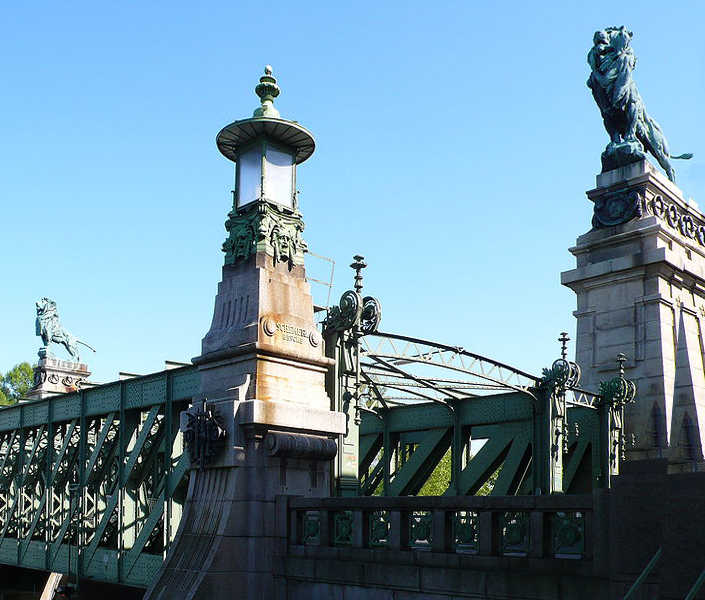
Otto Wagner’s impressive Nußdorf Weir and Lock (a flood control project on the Danube River, in Vienna), is a classic example of royal patronage of the civic architecture. Wagner was Austria’s leading architect in the late 19th and early 20th Centuries, and typical of that era and place such talent was sought after by the country’s rulers to not only design a functional public work, but to also create one that reflected the ruler’s superior tastes and command of public resources. While the United States may lack the royal patronage that fostered such impressive structures, Seattle is fortunate to have a noteworthy collection of well-designed public works that are not only pleasing to the eye, but also prompt exploration by the public who funded it. The Hiram M. Chittenden Locks on the Lake Washington Ship Canal, with their associated public gardens, concrete gate houses and promenade, and fish viewing platforms are a Seattle favorite, and in some ways like the Nußdorf Weir and Lock (minus the lions, of course) in that they are both water works. Here on the Hill, we are fortunate to have the Volunteer Park Water Tower, another water related piece of infrastructure.

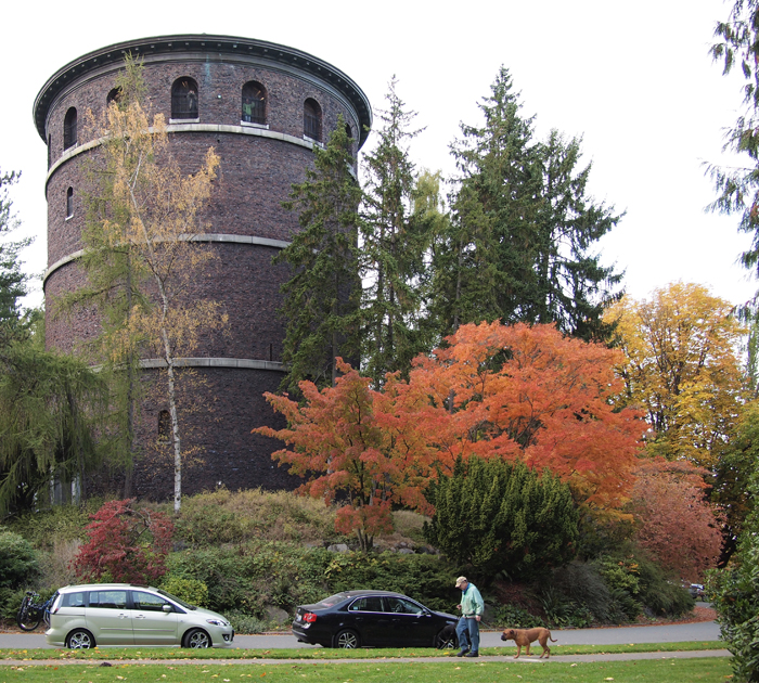
The water tower, built by the no longer extant Seattle Water Department in 1906, stands 75 feet 6 inches above the adjacent road (Capitol Hill's highest point), about the equivalent of a six to seven story building, thus making the top of the tower 520 feet; or, a couple of hundred feet shy of the Space Needle. One could actually say there are two towers in Volunteer Park, the brick outer tower and the steel-plate inner tower where the real business occurs. Seattle Public Utilities is now the steward of the water tower(s), which is adjacent a reservoir, another attractive piece of city infrastructure. The tower plays a vital role in our drinking water supply, as it provides pressure for the water pipes serving the needs of our Capitol Hill Community, some extra storage capacity, and doubtless some other functions as well.

[caption id="attachment_2897" align="alignnone" width="700" caption="Tower from the South East"][/caption]

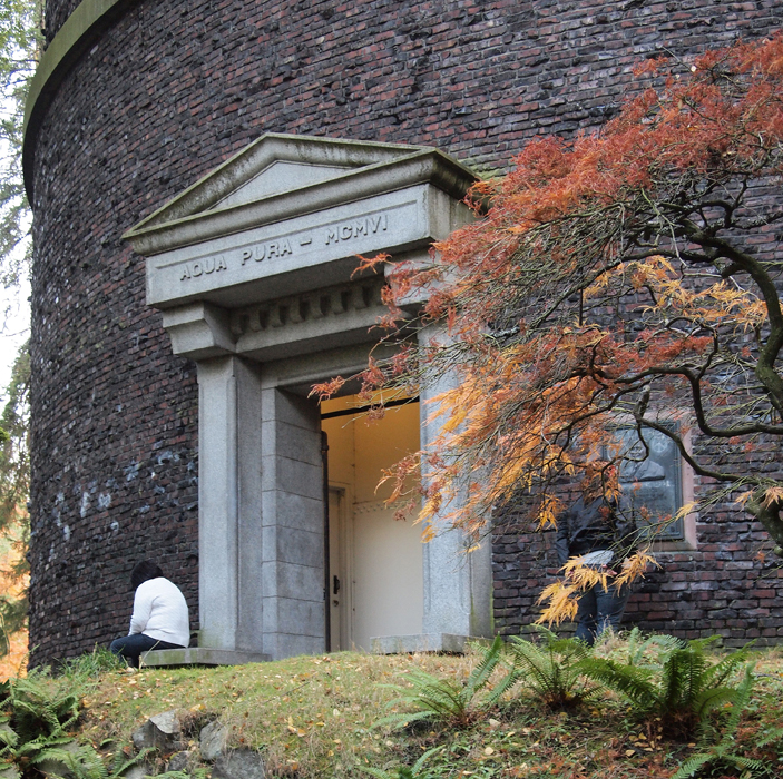
All well and good it is to store our water, but the ‘civic-ness(?)’ of the tower lies in the fact that it performs the above functions while simultaneously being great piece of public architecture, much in the same way as the Wagner and Chittenden Locks do, but in its own Capitol way and in a manner that fully exploits its advantageous location. The first hints of these beyond utility aspirations are in evidence in the pair of matching entries (on the north and south of the tower): each with its own proud, pedimented entry. And each made of that most robust and permanent of materials -- granite. And the text on the frieze -- Aqua Pura MCMVI – directly references to those ancient builders of the world’s most enduring water works, the great aqueducts of the Roman Empire. A bit haughty perhaps, but certainly appropriate.

[caption id="attachment_2895" align="alignnone" width="703" caption="North Entry"][/caption]

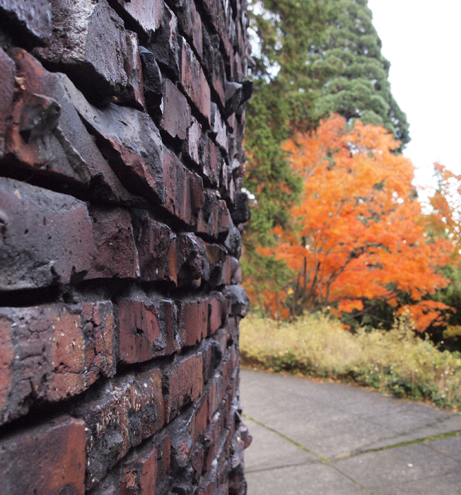
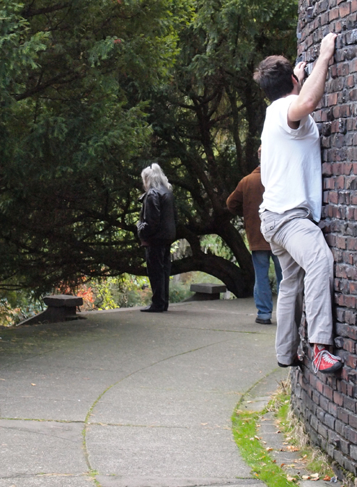
Another material flourish that raises the tower above mere utility is the clinker brick cladding. Clinker brick is a brick that has been fired at such a high temperature that it forms a glaze on its surface, and is often deformed in the process. Denser and stronger than typical brick, clinkers are typically used only as architectural accents in a larger field of simpler brick (they are a trademark of Capitol Hill’s Anhalt’s); however, the designer of the tower felt that the robust and rough appearance of the brick was appropriate to the underlying utility of the entire edifice, thus conveying a sense of age, while simultaneously of permanence. The shadow resulting from the deformed profiles of the clinkers, along with their stunningly rich and complex earth tones, help to dematerializes the structure; which, despite its height, fits in perfectly with Volunteer Park’s Olmstedian landscape. As an unintended bonus, their deformed profile lends them a convenient surface to grasp and rest one’s foot, a quality not lost to many a neighborhood rock-jock.

[caption id="attachment_2898" align="alignnone" width="652" caption="Clinker Brick"][/caption]


[caption id="attachment_2896" align="alignnone" width="513" caption="Climber"][/caption]

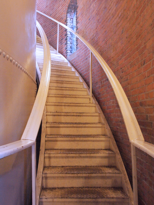
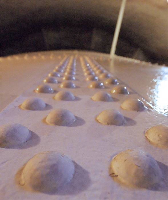
One-hundred-and-six (or is it seven?). That is the number of steps one must climb to reach the viewing deck – the great prize that Seattle Water Department gifted to us in the planning of the Tower. The steel steps emit a hollow-ringing sound as one ascends,  reverberating throughout the serpentine stairwell -- a nice warning that others are approaching. There is a pair of stairs, one for reach entry, which spiral around the water tank, double helix style. Once inside the stairwell, one can see the inner, steel tower, as the water contained within presents far too great a structural load for the brick to handle. The steel plates are riveted together as was common for steel fabrications of the period. I am not sure of the thickness of the plates, but I am sure it is measured in inches, not fractions thereof. And just look at those rivets, there must be thousands of them! And although I cannot be sure of this either, the tower assembly rests upon a mound, in an effort to conceal as well an enormous foundation, as well as related plumbing gear.

[caption id="attachment_2902" align="alignnone" width="525" caption="Stairs"][/caption]


[caption id="attachment_2901" align="alignnone" width="588" caption="Rivets"][/caption]

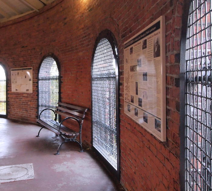
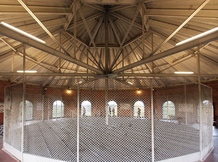
Once at the top, there is a real surprise for first time visitors and a justification to regulars who slog up the steps. Historic plaques, comfortable benches, and a generous number of large windows make the viewing platform a popular destination and pleasant place to rest, gaze out over the landscape, and learn some local history. The tectonic lessons are not over either, as the great steel tank does more than hold millions of gallons of water. It also helps to hold up the roof, or is it the other way around? In either case, there is some structural interaction between the two, as the mid-point of the trusses spanning the view platform has a pair of rods going down to the tank. I think the rods may actually brace the trusses that in turn brace the top of the brick wall, keeping the latter form falling over, in the same manner the rods that join the steel tower to the brick tower in the stairwells. But that is just a guess. The trusses themselves provide an opportunity see  uncommon, radial framing.

[caption id="attachment_2903" align="alignnone" width="700" caption="Interior"][/caption]

text

[caption id="attachment_2899" align="alignnone" width="700" caption="Roof Truss"][/caption]

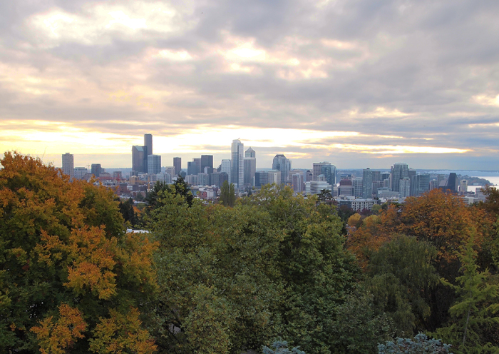
Yet even an enthusiast for architecture and civic design must confess that all the above is mere hyperbole, compared to the tremendous 360-degree view one gets of our gorgeous city.

[caption id="attachment_2900" align="alignnone" width="700" caption="View"][/caption]

Queen Anne Residence Remodel/Addition

“Places are spaces that you can remember, that you can care about and make a part of your life. Much of what is built now is too tepid to be remembered.”

Chambers for a Memory Palace, by Donlyn Lyndon and Charles W. Moore

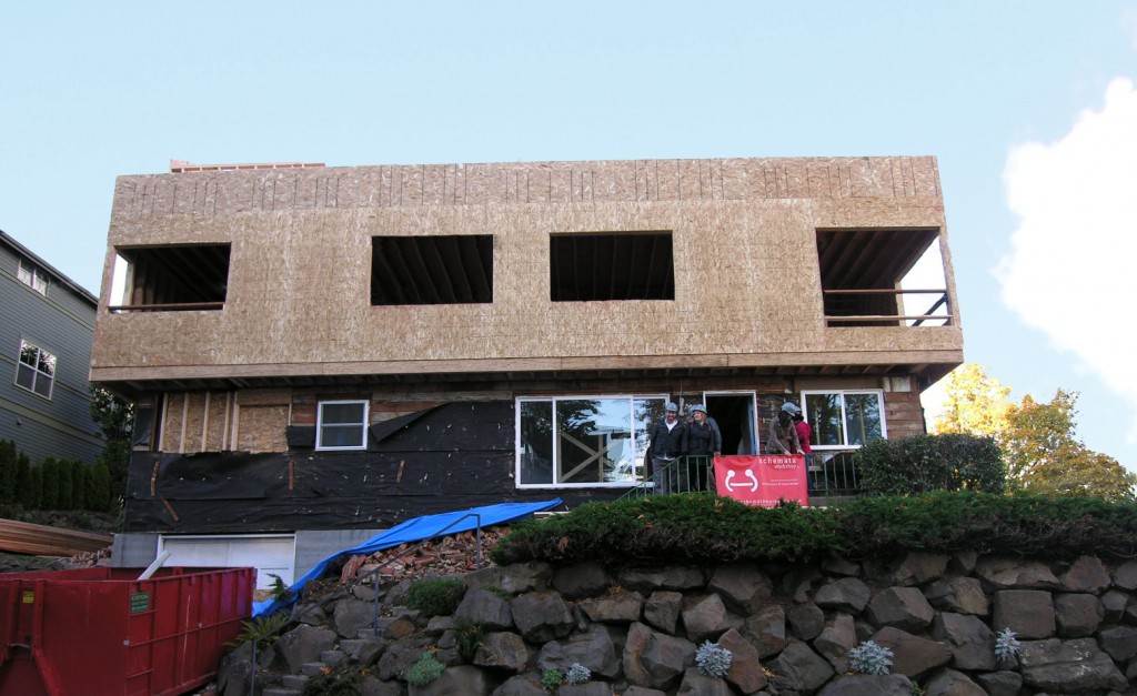
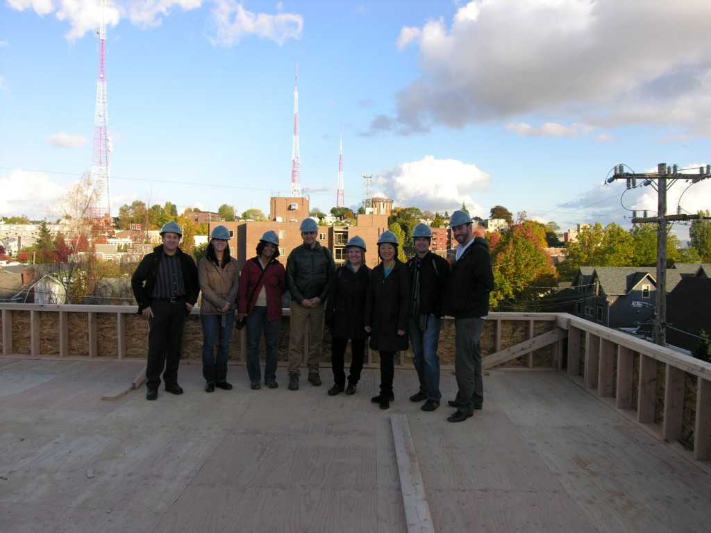
‘Tepid’ may be the word to describe this home before the renovation and addition but ‘memorable’ is now the word that takes its place. Although still in construction, it is beginning to take shape and its pronounced form is highly visible. No longer is it simply a modest home overshadowed by the tall adjacent homes but it is confidently perched on a hill to capture beautiful views of Seattle. The procession through the home is one that continues to entice, the main level has modestly high ceilings, keeping the ceiling height of the original home, while the second level increases the ceiling height by nearly a foot. When you finally reach the third story, the cabana level, the height is unrestricted on the large roof deck overlooking Seattle. This creates a pivotal destination point for the procession through the home.  All these moments have resulted in a truly memorable place that the residents are anxious to make a part of their life.

For more information and to see the rendering and sketches go to our website here


The Function of Ornament

Building at its most fundamental level is about providing shelter from the elements, and to that end is traditionally a reflection of the environmental forces that shaped it as well as the materials and technological savvy available to accomplish the task. Like many places, the Pacific Northwest has its own building traditions reflecting both its environment and resources. On a domestic scale, the craftsman bungalow, perhaps the most recognizable vernacular, possesses large overhangs, lapped siding, and skillfully executed wood trim -- all elements reflecting our region’s wet winter months and abundance of trees. With the expansion of national and international awareness, as well as industrialization, the ties of building to place are increasingly tenuous. Exotic examples from distant locations become more prevalent as designers search outside local precedent to things more tantalizing and evocative.

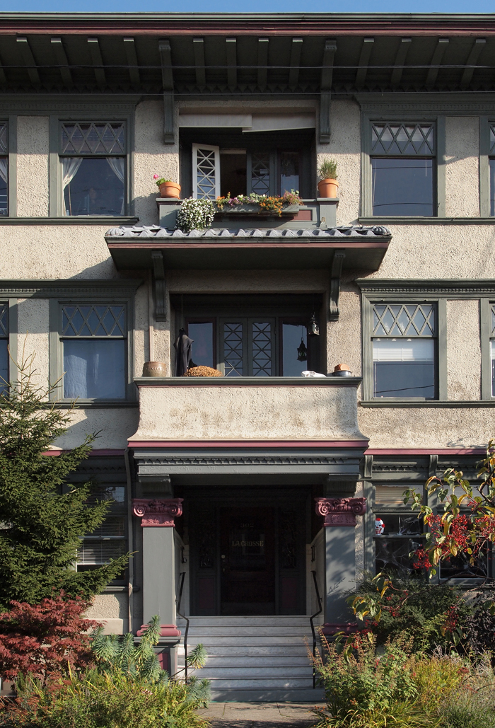
The Lacrosse Apartments, on the corner of East Thomas Street and Malden Avenue East, is a successful grafting of a typically Pacific Northwest single family residential architectural vocabulary. In this case the craftsmen style is applied onto a larger apartment building designed in a vernacular that is more likely to be seen in the warmer and sunnier climates to our south, in California or even Mexico. This pairing of rather distant vernaculars may at first strike one as odd, but upon further consideration the regional modification to a stucco building makes sense. Generous roof overhangs and projecting window trim, as well as a subtly projecting cornice between the first and second floors, are among those elements on the Lacrosse easily associated with bungalows, while broad expanses of stucco (including Spanish Rococo inspired parapets) reveal some of the Lacrosse’s southern heritage.  Given that stucco needs greater rain protection than the typical brick or lap-siding-clad Capitol Hill apartment, the above mentioned craftsmen elements make a good deal of sense.

Seen from the intersection of Malden Avenue East and East Thomas Street, one of the first architectural features to catch the eye is generous roof overhang, which add a distinctive horizontal emphasis to the elevations. The projecting roofs are larger than one would typically encounter on a bungalow, as they are here appropriately scaled to a three-story building, where the overhang provides greater weather protection to the taller building. Visually, the larger size of the overhangs combined with their lower height relative to the building corners act as a subtractive counter point in distinction to the taller vertical corners. Where the overhangs are absent, the parapets have a robust cap, whose heft -- while not as effective as the overhangs -- provides some measure of water protection to the top of the wall.

[caption id="attachment_2488" align="alignnone" width="700" caption="The Lacrosse Entry"][/caption]

The Lacrosse’s entry concisely presents many of the building’s noteworthy elements. Columns flanking either side of the stair support a balcony, the base of which is a low cornice demarcating the first from the second floor, while the roof sheltering the balcony provides another hint of the Lacrosse’s dual heritage in the curved ceramic tile shingles commonly seen on mission style buildings. The Terra-cotta pots, although not part of the architecture, are a nice touch. Over-sized support brackets at both the balcony and building roofs lend importance to these portions of the elevation. Also well represented at the entry is the building’s contrasting use of color.

[caption id="attachment_2490" align="alignnone" width="700" caption="Corner Tower at Malden and Thomas"][/caption]

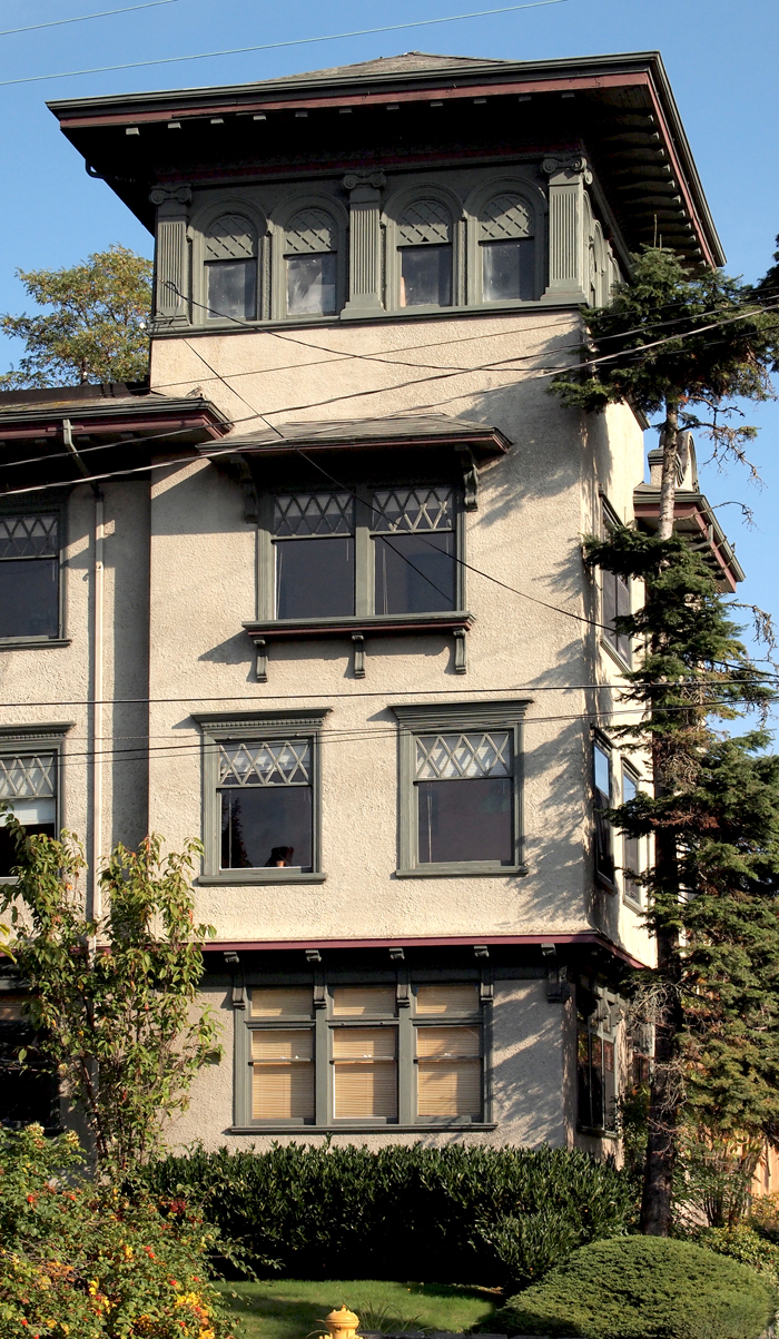
In the above view, the more expressive realization of the cornice first encountered at the entry balcony can be seen demarcating the first and second floors. Above the cornice a slight outward curve directs rainwater away from the first floor, as the roof overhang is too distant to offer much assistance. Above the cornice, the projection of trim over the window’s head deflects water away from the opening, while on the third floor a mini-hip roof protects a pair of windows on the Lacrosse’s main facade. The intersection of Malden Avenue and Thomas Street is marked by a tower which has a post and beam structure, another reference to our region’s timber framing. The transition from the visual mass and solidity of the stucco-clad building base to the lighter and more transparent top floor is one of the best expressive building corners on Capitol Hill and is well integrated with the building's tectonic vocabulary.

[caption id="attachment_2493" align="alignnone" width="700" caption="Cornice at First Floor Window"][/caption]

The attention to detail by the building’s designer is in evidence here, the transition from the cornice, to brackets, to window framing. All elements easily flow from one to another, without a break in rigor. It is as if the second floor gently extended out from the first floor, extruding the brackets in the process. This detail is in contrast to that of the brackets at the entry and the hip roof on the corner, where the desire was to compose those elements as added to the building’s mass, as they are not integral to the window framing and are instead supported by the stucco wall, revealing that every detail has its own specific place within the whole.

Assigning stylistic principles to buildings, while convenient, can gloss over their origins. While craftsman is certainly an easier moniker than, for example, “from-the-damp-northwest-and-made-of-timber”, a knowledge of both the stylistic name and its environmental genesis makes field observations more fulfilling, especially as we gaze upon an assemblage of differing ‘styles’ as well executed as those in the Lacrosse Apartments.


611 Malden Avenue East

Early modernists designers were not gripped by the fear of using brick, as were many later practitioners. With an emphasis on the new, the factory assembled, and the lightweight, early moderns had many reasons to eschew brick: it was traditional, it was heavy (relative to newer materials such as steel and aluminum), and its appearance was fully embraced by society.  Brick was hardly capable of eliciting the wonder and novelty of the new that many of the then avant-garde architects craved. Though I have some sympathies with their reasoning, omitting such a useful material on ideological grounds is not compelling enough to overshadow its many positive attributes, including those of economy, durability, and scale. Looking back far enough, say to the first quarter of the 20thCentury, one finds that brick did make an occasional appearance in modernist design, proving that the goals of cubic mass, simple form, and restraint of ornament were still possible in these brick clad anomalies. These outliers may have come to be because the newer materials architects really wanted to use were not yet readily available nor understood by builders. Mies, the main harbinger of glass and steel, frequently used brick prior to the 1930s, but even such examples are rare (Frank Lloyd Wright is a notable exception). The Lange House, one of Mies’s brick houses, built in 1930. While the brick could have easily been covered in stucco -- making it more abstract and purer of form -- to my eye the brick takes little away from the cubic massing and clean lines. The cleanly detailed brick, along with expansive ribbon windows and an aggressively cantilevered entry canopy leave little room for debate that this is a modernist building. Nevertheless, such well executed buildings did not propagate a confidence that brick was suitable in achieving a modernist aesthetic, its qualities being overlooked in favor of more contemporary and non-traditional materials.

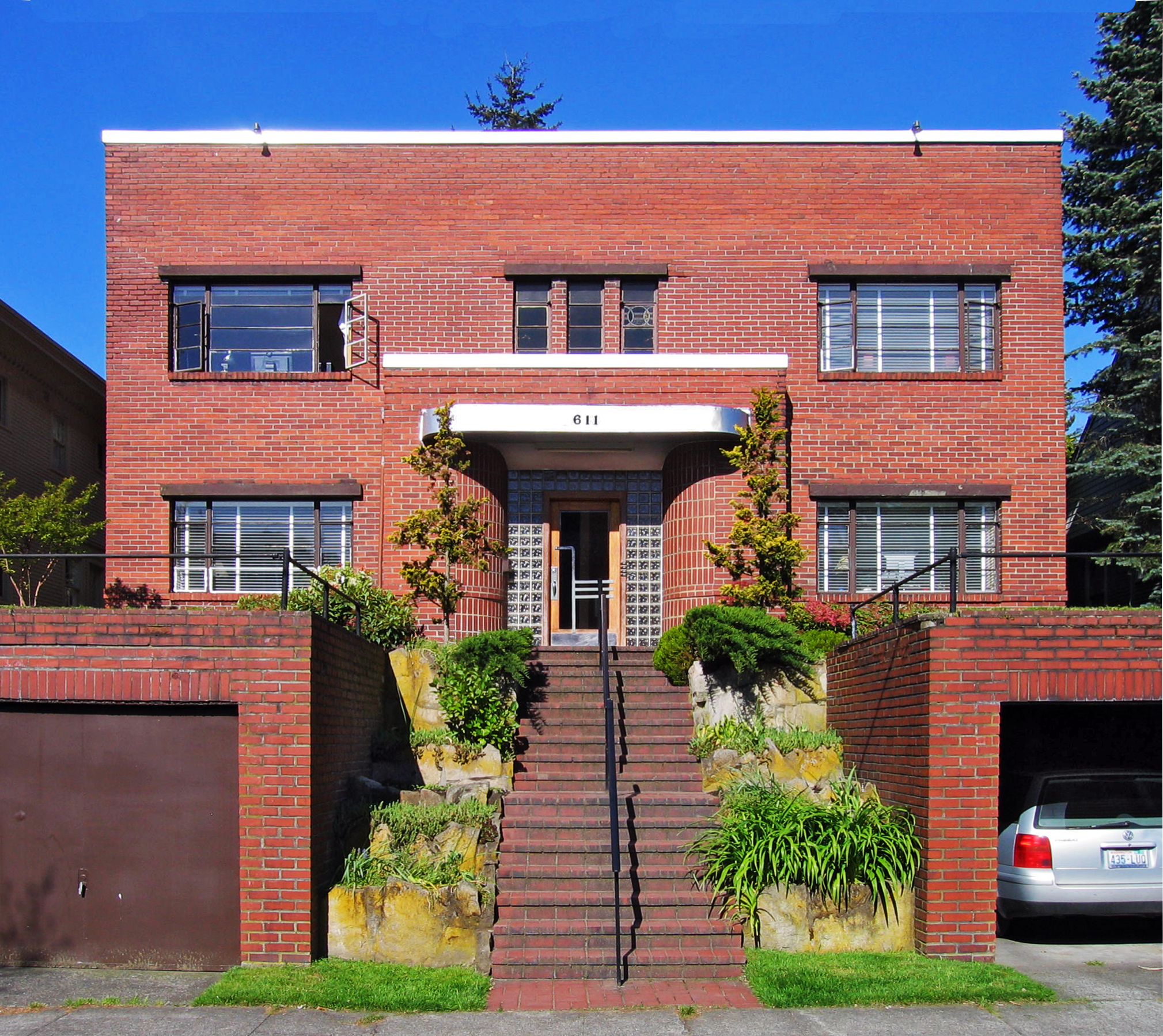
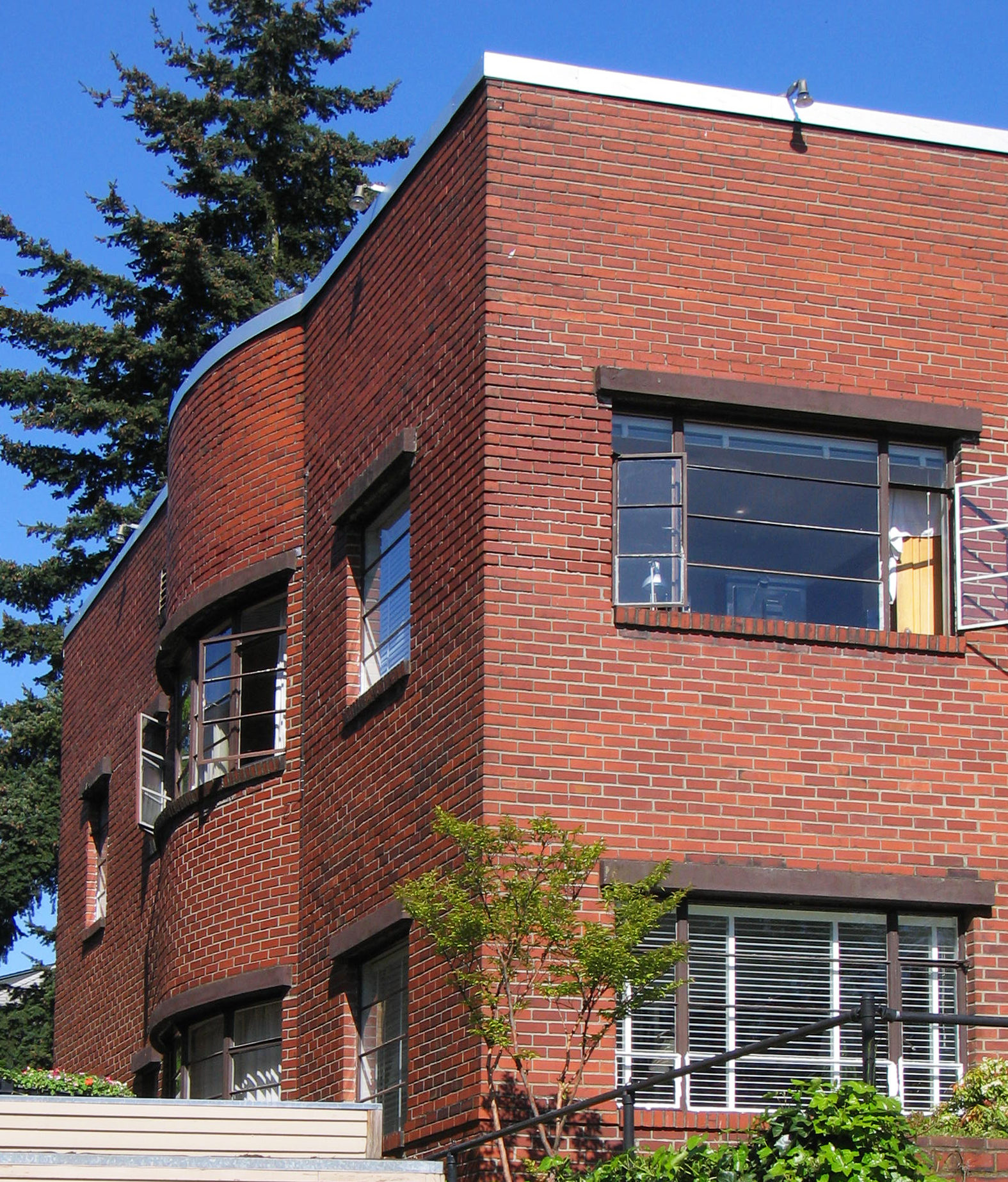
Malden Avenue East -- a favorite Capitol Hill street -- has one of our best early modernist  buildings that not only embraces brick in the tradition of the Lange house, but also shows that its author had no qualms as to its appropriateness in expressing their design intentions. Furthermore, the diminutive number 611 combines the above early 20th Century aesthetic with another equally short-lived, early favorite -- art deco -- an unsung hero of early modern design. Especially exciting about 611 is that (according to King County records), it was built in 1907, making it one of Seattle very early modern buildings, and is step with goings on in other major cities.

While it may be a bit of a push to make much out of cubic massing in such a small building (there is little room to do anything else but), its squareness of presentation nevertheless toes the party line of early modernism, and is punctuated by the squat box that forms the entry vestibule. The building's dual heritage of early modernism and deco is further revealed at the vestibule, where a gently curving, shiny aluminum (or painted to look aluminum) canopy furthers the deco association. Other delightful touches at the vestibule include bricks forming another curve, leading to a deco inspired door surrounded by glass block (one of modernism's most misused materials, but used quite well here). Although lacking the horizontality that the windows that the Lange House displays, those on 611 have a pleasing horizontal proportion to them (kudos to the building's owner for keeping them intact).

Flanking the entry stair are a pair of garages that are as well-integrated into a project as you will see on the Hill, and whose function in the project exceeds the mere utility of parking cars by not only framing the entry steps but also by extending the useful  size of the front lawn. Also done in brick, the garage masses give the small building a greater heft. The pipe rails, lacking the inner rails required by current codes, are a nice foil to the garages' mass, and would do Mies proud. While strong in their attitude to the street, the garages fit in perfectly with the overall  building-landscape approach, stepping down to the sidewalk in a flowing transition of building, turf, garage, and sidewalk.

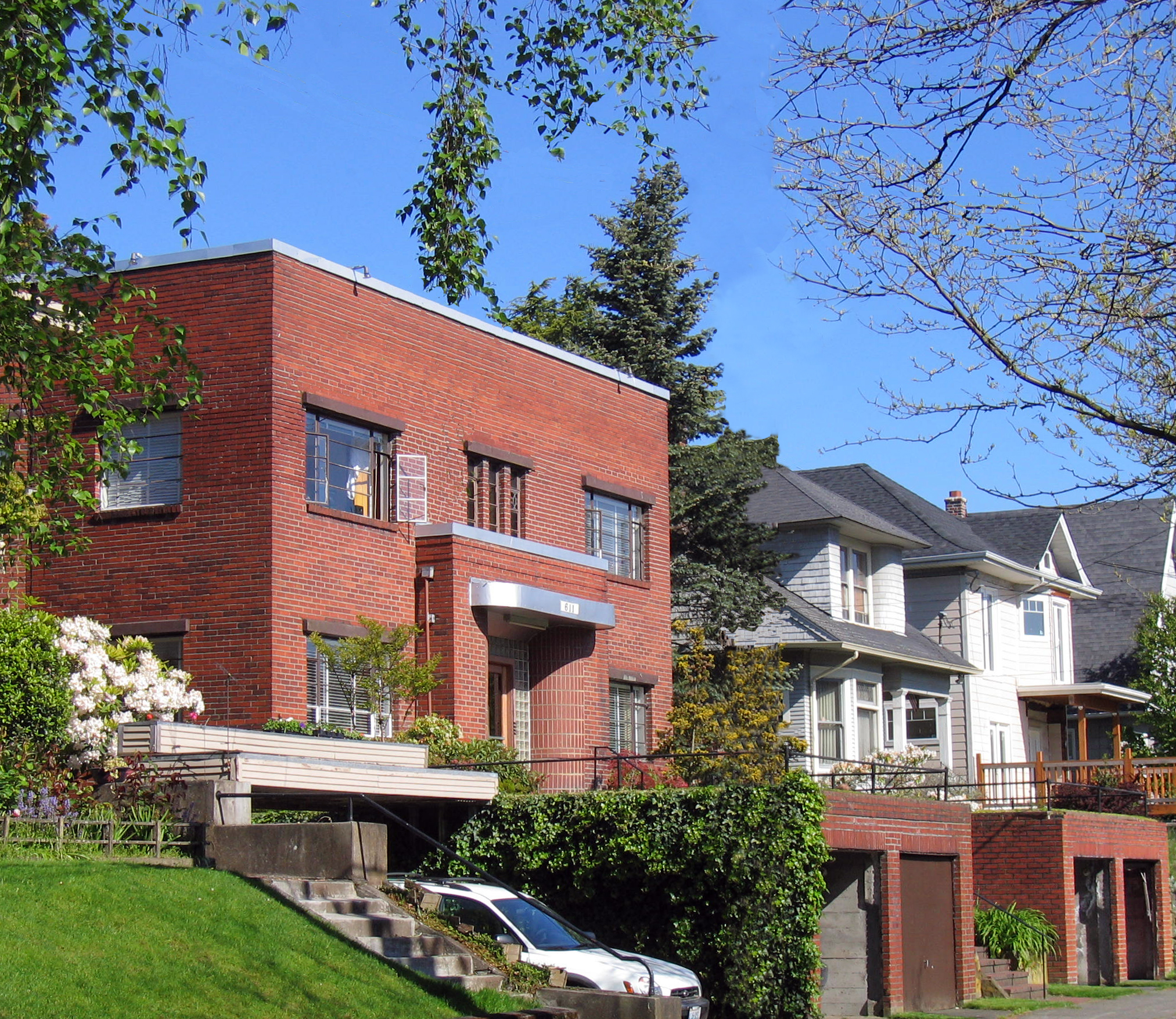
Not all is serious at 611, yet all has its place. The north and south elevations are a bit more relaxed than the rigors of the front, where the mass of brick is pushed out midsection by another gently curving wall, this time on both floors. Not on the front, mind you, where it would be more ‘expressive’, but on the sides, and partially hidden from the street. Perhaps the curved walls ended up on the sides because the interior space dictated their placement, where they may have the greatest benefit to those inside the building; certainly a more important consideration than to those passing by on Malden. Perhaps the architect of this modest yet excellent little building had the confidence and conviction of a seasoned hand, knowing that a little lapse in the rigor of the box -- especially if veiled from one's glance -- would not detract from the nobility of the whole, and felt compelled to be discrete by keeping the curved walls on the side elevations, maintaining the modest street frontage. Perhaps this same perceived modesty kept the architect from making the curved wall out of another material, even another pattern of brick? If my speculations ring true, 611 presents a lesson in modesty from which most of my architect-collegues would benefit.