Design Thoughts

Seattle Asian Art Museum Part 2

The Seattle Asian Art Museum (SAAM) comprises Seattle's greatest gallery spaces and its finest art collection. The original home of the Seattle Art Museum (SAM), it was relegated to display only a portion of it collection -- Asian art -- when the first downtown location opened in the early 1990s. While it was welcome that SAM's collection warranted additional space and a new building, it is lamentable that those newer buildings (totaling two, including the 2000's addition) have perhaps drawn attention from the original Volunteer Park home, where you will find not only an incredible art collection, but one of Seattle's finest buildings. No single space better exhibits the vibrancy and quality of both qualities than the Richard E. Fuller Court, the physical and spiritual center of SAAM's collection. Bathed in daylight, it is voluminous and resplendent in rich materials and fine sculpture. Just off of the museum's entry hall (highlighted in the previous SAAM post: http://www.schemataworkshop.com/blog/2012/03/seattle-asian-art-musuem-art-deco-splendor-in-volunteer-park/), the Court is the museum's most architecturally ambitious space and the hub off which other galleries radiate.

Copyright 2012 John M. Feit

Copyright 2012 John M. Feit

The sculpture within the Court takes full advantage of the daylight offered by the luminous ceiling, the pieces glowing in a diffuse light that evenly illuminates and reveals the skill that went into crafting these ancient pieces. Many architects struggle with using daylight in museums, leading to often drawn shades or perpetually darkened galleries that make way finding -- not to mention the display of art work -- difficult. At SAAM the architects realized the importance of daylight in displaying art and organizing the building. The Fuller Court also features a piece specifically commissioned for the space: a hand wrought, iron gate whose motifs are quite a contrast from the streamlined art deco of the museum's architecture.

Copyright 2012 John M. Feit

Copyright 2012 John M. Feit

Copyright 2012 John M. Feit

Copyright 2012 John M. Feit

Copyright 2012 John M. Feit

Copyright 2012 John M. Feit

The entry from the main lobby into the Court has columns clad in the same green granite that one finds in the lobby. Note how the stepping of the entrance walls framing the Foster Galleries (second image down) -- along with the coved ceiling within the galleries -- emphasizes the perspective, increasing the formality of the spaces. Other deco details include the aluminum handrails (a nice reference back to the entry facade's aluminum grille) and the font used to name the gallery. 

Copyright 2012 John M. Feit

Copyright 2012 John M. Feit

Copyright 2012 John M. Feit

Copyright 2012 John M. Feit

Once inside the galleries, the quality of the art pieces exceeds the expectations set forth by the quality of the architecture. A captivating mixture of sculpture, furniture, textiles, decorative arts, and paintings almost overwhelm the senses with a richness of materials and delicacy of execution. Providing a harmonious union between the art and architecture, the care exhibited by the museum's curators in the arrangement of the pieces throughout the various galleries makes for a fulfilling viewing. Each art piece is carefully staged, with the lighting and context perfectly balanced to best show off the treasures.

Copyright 2012 John M. Feit

Copyright 2012 John M. Feit

Copyright 2012 John M. Feit

Copyright 2012 John M. Feit

Copyright 2012 John M. Feit

Copyright 2012 John M. Feit

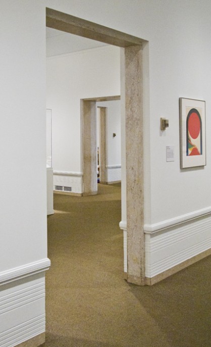
Exploring the galleries one becomes aware of the thematic elements the architects choose to both distinguish and unify the galleries. The elements of unification are at a detail level, and include door trim in stone to match that of the wall base, as well a wainscot with cleverly integrates the heating and cooling grilles. The elements of distinction are the ceilings, that provide the greatest variety of expression from coved and luminous to gently arched, morphing as one progresses deeper in the museum. Being overhead and in one's peripheral vision, the ceiling's strong charter in any given room takes a background role and does not compete with the artwork, yet has enough presence to reinforce the building's design aesthetic as well as lending each gallery a unique character. My favorite ceiling expression occurs in the gallery deepest in the back, where the arches align with large windows that provide a splendid view to Volunteer Park.

Copyright 2012 John M. Feit

Copyright 2012 John M. Feit

Copyright 2012 John M. Feit

Copyright 2012 John M. Feit

It is of course not unusual for museums to incorporate the level of detail as shown in SAAM; patrons for such buildings have the developed sensibilities that allow architects greater freedom of design than in a typical commission. And though relatively luxurious by today's restrained architectural tastes, SAAM's compact size allows for a leisurely visit that not only affords experiencing of all the building and art work with our getting fatigued.

Copyright 2012 John M. Feit

Copyright 2012 John M. Feit

Copyright 2012 John M. Feit

Copyright 2012 John M. Feit

Commanding the summit of Capitol Hill, the SAAM boasts a world class collection of art that is thoughtfully displayed in one of Seattle's most captivating buildings and greatest parks. And given that admission is free on the first Thursday and the first Saturday of every month, there is absolutely no excuse not to enjoy it soon.

Modular Construction - A Tipping Point for the Affordable Housing Industry?

For more than a decade I’ve been touting the benefits of modular construction to the affordable housing industry.  In the early years, I was trying to convince bankers that modular construction was real property – they confused modular with manufactured housing (aka mobile homes or double wides).  Then it was talking with General Contractors about how their subs would bid out the site work, and whether they would charge a premium due to decreased scope or uncertainty about scope.  And the latter few years was spent encouraging an Owner to be the pioneer – to be the first to build a multifamily affordable housing project using modules. 

tortise and the hare

tortise and the hare

At times I felt like I was the proverbial tortoise watching the hares run by with built prototypes and talk of market rate multifamily projects. Michelle Kauffman, with her Breeze House and Glide House, opened up the single family market and suddenly prefab was perceived as cool and sustainable by the likes of the Sunset and Dwell magazine readership. When Michelle was a keynote speaker at the Housing Washington Conference [1] a few years back, I thought “wow, it’s about to tip!” But it didn’t.

Until now.

On July 23, we opened bids for Schemata’s first modular construction project. The pioneering client is the Renton Housing Authority. The project is an 18-unit 2-story multifamily project – predominantly townhomes but with four stacked flats, making the scope a perfect test case.

2013_0315 Modular Graphic-1.jpg

Modular construction means that residential units arrive on site 90% complete with interior finishes, flooring, plumbing and lighting fixtures, electrical wiring, plumbing lines, windows and even exterior cladding if you choose. The modules are trucked to the site and lifted onto a site built foundation by a mobile crane.  

OneBuild Modular Setting

OneBuild Modular Setting

The state and county funders thought the project was very innovative and awarded the project funding on the first round, which was quite an accomplishment in such a competitive environment.  And while construction for sitework will commence immediately, the L&I approval process [2] for the modules is just starting with the selected manufacturer which means that modules cannot begin production for at least 2-3 months. 


The design of the project started off with a strong understanding of the shipping constraints [3].  While modular construction can accommodate wide open and double height spaces, the greatest economy can be achieved when modules are essentially intact, self-contained boxes.  Given the tight construction budget, we elected to be conservative with our first project and go the latter route, expressing the modularity of the construction type in both the unit planning and exterior expression.  Intent on a design that would allow the new homes to fit in with the neighboring modest and traditional housing, we looked at the gable form of the archetypal house.  However, the width of the units were 14’ wide and gables over each unit which would have created a busy roofline.  Instead, the gable was split over 2 units and the two halves slid past each other to provide modulation along the street.

KAT concept diagram

KAT concept diagram

As townhomes, the stacking of units creates a fairly straightforward connection (or marriage) of modules with similarly straightforward wall and floor/ceiling assemblies; however, transition between the floors (namely at the stairs) had to be increased due to the redundant structure in the floor/ceiling assembly which resulted in lower ceiling heights than typically desired. The flats were not limited in ceiling height and the floor/ceiling assembly still posed some challenges relative to the sound transmission and impact noise.  In addition, the marriage line required some attention in the detailing since there were openings between modules.  This was not an issue at all with the Townhomes since the connection between modules was only vertical. However, the marriage line at the stair between upper and lower modules will be carefully reviewed during the “button up” phase [4].

Many owners assume incorrectly that modular inherently means a savings in construction cost.  As one modular vendor aptly described, modular construction uses the same lumber and drywall that a site –built project requires. The deliveries that occur to a job site still take place, just at a factory leading to basic materials costs which are more or less the same as traditional site-built construction.  It is true that the working conditions in a factory are much more efficient and result in lower material spoilage and waste, yet any cost savings in labor are offset by the fact that the modules are over-engineered to withstand the structural impacts of transport and lifting by crane. In fact, there is almost double the wood framing in a modular construction project than typical site-built project, making the modules very structurally robust. So it is not feasible that the costs would be less. Now if there were some economies of scale (not as significant on an 18-unit project), there is the possibility for the overall cost per square foot of the modules to come down significantly.  

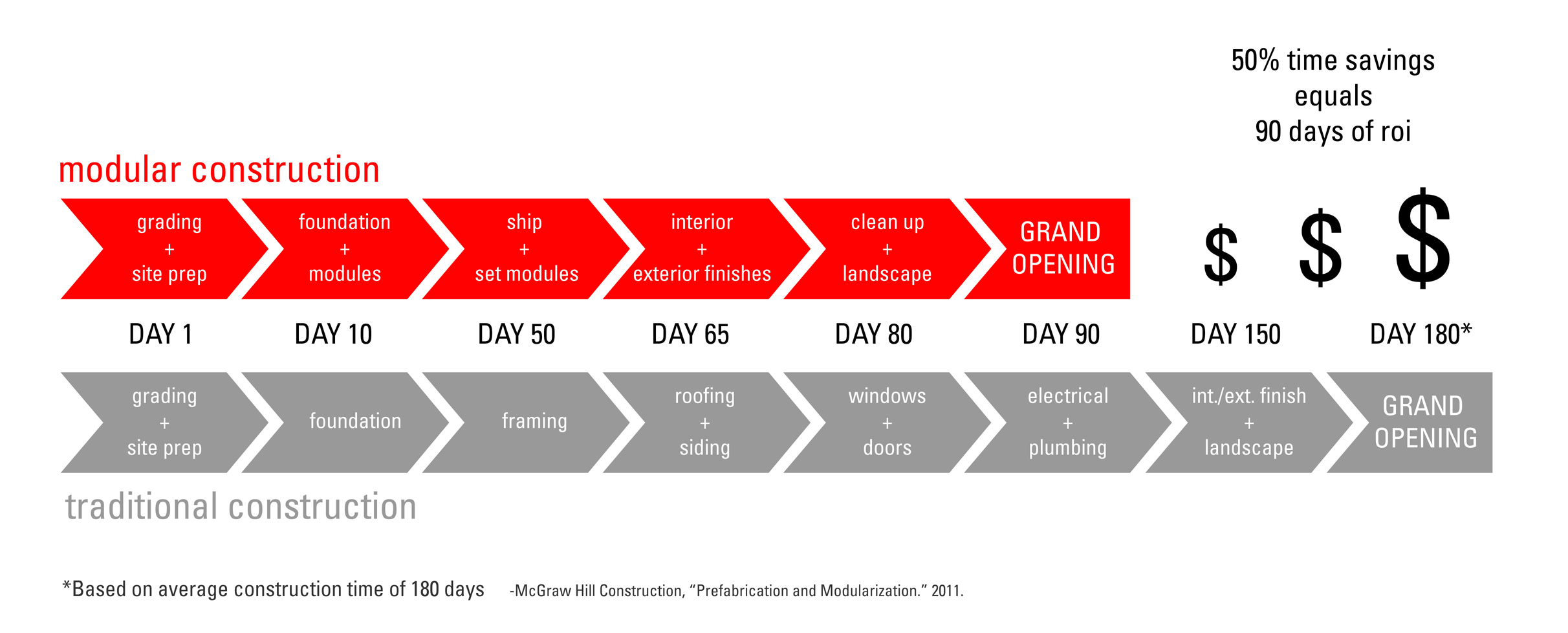
Where the potential cost savings lie are in the construction interest carry. For any developer of affordable housing, the ability to reduce the amount of interest paid means that there are more funds available for higher quality, durable finishes or a play structure for the children who will live in the project, or the staff time to provide supportive services for the residents.

2013_0315 Modular Graphic-2.jpg

Shorter construction time also means that the units are available for residents to move in sooner meaning the owner can start collecting rents and servicing the debt faster.  This is of benefit to any multifamily developer, non-profit or market rate.  However, for the affordable housing developers, the ability to provide more units in a shorter timeline means that they have the ability to serve more hard-working families, seniors, and veterans in need of housing.

We look forward to seeing whether Schemata’s first modular construction project will be the tipping point for the affordable housing industry and for Schemata’s multifamily portfolio.

  1. Housing Washington is the state’s affordable housing conference.  It is held annually and between 700-800 people attend - primarily non-profit housing developers, public housing authorities, social service providers, lenders, attorneys, architects and contractors working in the affordable housing industry.  As one of the largest of its kind, the conference draws 10% of the attendees from other parts of the country.
  2. Washington State Labor & Industries will review the modular plans for adherence to building and energy codes.  L&I will issue a Gold Insignia for each module, which will dramatically decrease the permitting costs but will increase the costs for special inspections.
  3. Trucking dimensions are roughly 14’ wide, 65’ long and 14’ tall.  Modules can be wider or longer, but pilot cars will be required, adding to the already high transportation costs. 
  4.  Button up refers to the patching of the marriage line between modules – both vertically in the townhouse stair and horizontally between rooms of the flats.