Housing

Modular Construction - A Tipping Point for the Affordable Housing Industry?

For more than a decade I’ve been touting the benefits of modular construction to the affordable housing industry.  In the early years, I was trying to convince bankers that modular construction was real property – they confused modular with manufactured housing (aka mobile homes or double wides).  Then it was talking with General Contractors about how their subs would bid out the site work, and whether they would charge a premium due to decreased scope or uncertainty about scope.  And the latter few years was spent encouraging an Owner to be the pioneer – to be the first to build a multifamily affordable housing project using modules. 

tortise and the hare

tortise and the hare

At times I felt like I was the proverbial tortoise watching the hares run by with built prototypes and talk of market rate multifamily projects. Michelle Kauffman, with her Breeze House and Glide House, opened up the single family market and suddenly prefab was perceived as cool and sustainable by the likes of the Sunset and Dwell magazine readership. When Michelle was a keynote speaker at the Housing Washington Conference [1] a few years back, I thought “wow, it’s about to tip!” But it didn’t.

Until now.

On July 23, we opened bids for Schemata’s first modular construction project. The pioneering client is the Renton Housing Authority. The project is an 18-unit 2-story multifamily project – predominantly townhomes but with four stacked flats, making the scope a perfect test case.

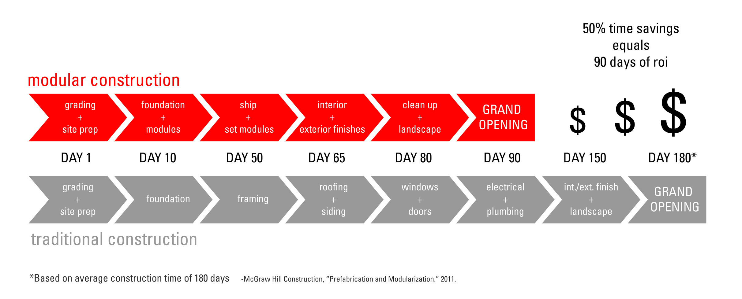
2013_0315 Modular Graphic-1.jpg

Modular construction means that residential units arrive on site 90% complete with interior finishes, flooring, plumbing and lighting fixtures, electrical wiring, plumbing lines, windows and even exterior cladding if you choose. The modules are trucked to the site and lifted onto a site built foundation by a mobile crane.  

OneBuild Modular Setting

OneBuild Modular Setting

The state and county funders thought the project was very innovative and awarded the project funding on the first round, which was quite an accomplishment in such a competitive environment.  And while construction for sitework will commence immediately, the L&I approval process [2] for the modules is just starting with the selected manufacturer which means that modules cannot begin production for at least 2-3 months. 


The design of the project started off with a strong understanding of the shipping constraints [3].  While modular construction can accommodate wide open and double height spaces, the greatest economy can be achieved when modules are essentially intact, self-contained boxes.  Given the tight construction budget, we elected to be conservative with our first project and go the latter route, expressing the modularity of the construction type in both the unit planning and exterior expression.  Intent on a design that would allow the new homes to fit in with the neighboring modest and traditional housing, we looked at the gable form of the archetypal house.  However, the width of the units were 14’ wide and gables over each unit which would have created a busy roofline.  Instead, the gable was split over 2 units and the two halves slid past each other to provide modulation along the street.

KAT concept diagram

KAT concept diagram

As townhomes, the stacking of units creates a fairly straightforward connection (or marriage) of modules with similarly straightforward wall and floor/ceiling assemblies; however, transition between the floors (namely at the stairs) had to be increased due to the redundant structure in the floor/ceiling assembly which resulted in lower ceiling heights than typically desired. The flats were not limited in ceiling height and the floor/ceiling assembly still posed some challenges relative to the sound transmission and impact noise.  In addition, the marriage line required some attention in the detailing since there were openings between modules.  This was not an issue at all with the Townhomes since the connection between modules was only vertical. However, the marriage line at the stair between upper and lower modules will be carefully reviewed during the “button up” phase [4].

Many owners assume incorrectly that modular inherently means a savings in construction cost.  As one modular vendor aptly described, modular construction uses the same lumber and drywall that a site –built project requires. The deliveries that occur to a job site still take place, just at a factory leading to basic materials costs which are more or less the same as traditional site-built construction.  It is true that the working conditions in a factory are much more efficient and result in lower material spoilage and waste, yet any cost savings in labor are offset by the fact that the modules are over-engineered to withstand the structural impacts of transport and lifting by crane. In fact, there is almost double the wood framing in a modular construction project than typical site-built project, making the modules very structurally robust. So it is not feasible that the costs would be less. Now if there were some economies of scale (not as significant on an 18-unit project), there is the possibility for the overall cost per square foot of the modules to come down significantly.  

Where the potential cost savings lie are in the construction interest carry. For any developer of affordable housing, the ability to reduce the amount of interest paid means that there are more funds available for higher quality, durable finishes or a play structure for the children who will live in the project, or the staff time to provide supportive services for the residents.

2013_0315 Modular Graphic-2.jpg

Shorter construction time also means that the units are available for residents to move in sooner meaning the owner can start collecting rents and servicing the debt faster.  This is of benefit to any multifamily developer, non-profit or market rate.  However, for the affordable housing developers, the ability to provide more units in a shorter timeline means that they have the ability to serve more hard-working families, seniors, and veterans in need of housing.

We look forward to seeing whether Schemata’s first modular construction project will be the tipping point for the affordable housing industry and for Schemata’s multifamily portfolio.

  1. Housing Washington is the state’s affordable housing conference.  It is held annually and between 700-800 people attend - primarily non-profit housing developers, public housing authorities, social service providers, lenders, attorneys, architects and contractors working in the affordable housing industry.  As one of the largest of its kind, the conference draws 10% of the attendees from other parts of the country.
  2. Washington State Labor & Industries will review the modular plans for adherence to building and energy codes.  L&I will issue a Gold Insignia for each module, which will dramatically decrease the permitting costs but will increase the costs for special inspections.
  3. Trucking dimensions are roughly 14’ wide, 65’ long and 14’ tall.  Modules can be wider or longer, but pilot cars will be required, adding to the already high transportation costs. 
  4.  Button up refers to the patching of the marriage line between modules – both vertically in the townhouse stair and horizontally between rooms of the flats.

The Kingshire: A Mid-Century Sleeper on Harrison

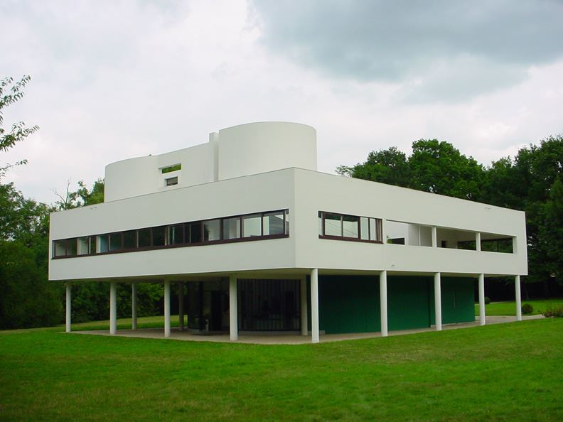
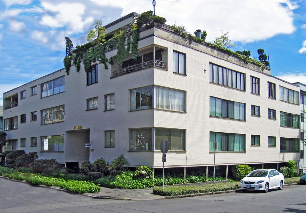
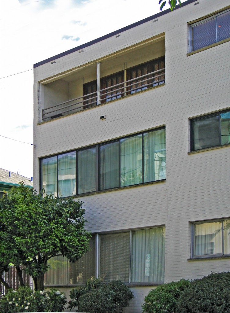
Every time I walk by the Kingshire, at the intersection of 14th Avenue  East and  East Harrison, I flatter myself and wonder if I am the only one who appreciates its dignified and restrained design. After all, it is only a white box with a relatively flat facade and an entry that hardly gives one pause. Despite these attributes (or because of them), the Kingshire is a little beauty with a subtle complexity to it and is a great example of many of the finer points of modernism. Among these is the nifty way the building touches down on its site, with its brick façade wall held up by diminutive pipe columns supporting a steel lintel. Both the scale of the columns and the void they create are certainly a reference to the design prerogatives of modern masters such as the Swiss architect Le Corbusier, whose pilotis (columns that allow for the raising of a building in order to let the landscape pass underneath) became a modernist icon.

The Villa Savoye (1929)

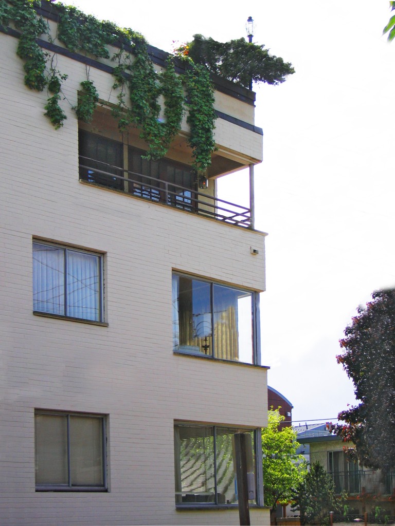
On the Kingshire, the height afforded by the columns is of a decidedly smaller scale than that of the Villa Savoye, and most likely is a recognition of this building’s urban setting and its need to create a strong street edge. The roof too makes a nod toward Le Corbusier, with its lushly planted roof garden and well-tended foliage gracefully hanging over the parapet. Between the pilotis and roof garden (and setting up the base, middle, and top architects do so love) is the middle facade where the shifting of widow openings and mullion patterns from floor-to-floor, as well as a pair of subtractive windows (perhaps another reference to the Villa Savoye?), reveal the Kingshire to have a host of latent surprises.  Such variety in articulation is a fine example of how even a slight alteration in an otherwise regularized design vocabulary is effective at achieving variety and nuance. Note how the third floor corner windows have either more tightly spaced mullions, a flipped orientation compared to their lower floor brethren, or are even subtractive.  Best of all, these design distinctions a grounded within the building’s simple vocabulary.

Painted white to achieve a certain level of modernist abstraction, the building convincingly uses brick as its skin.  Modernism generally eschewed brick as being too traditional, instead preferring white stucco. None-the-less, the brick here provides a reliably crisp edge around the openings; perhaps the most effective single detail one can lend a building to give it a sense of scale. Built in 1957, the Kingshire is one of the Hill’s most handsome modernist buildings. Sadly for us, there are not many examples of its type, which is a shame as its design has an economy and suitability that would make new derivations of its design precedence most welcome even 55 years later.

The Subversive Origins of the Craftsman Bungalow

Charming, desired by many, and ubiquitous in the Pacific Northwest, the Craftsman bungalow is the quintessential Seattle home typology, yet its origins have a decidedly more contrarian nature than one would think given its pleasant demeanor. Granted, one’s attraction to any given building is typically founded on whether one finds its appearance pleasing, its utility supportive for its prescribed tasks, and it‘s construction and craft sufficiently robust – qualities that the Craftsman succeeds at with verve.  The bungalow is also noteworthy in that it is also one of our regions’ best representations of the ever-present, larger cultural forces shaping our built environment. These forces bear themselves out once one looks beyond the Craftsman’s ‘Northwest regional’ charms and compares it to the buildings it resolutely, if politely, stands in contrast to. As usual, our very own Capitol Hill provides among the best venues in Seattle to ponder the inherent contradictions of charming versus agitating exemplified by this building type.

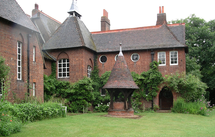
The Red House, London, England (Wikipedia Image)

Tracing it roots to the English Arts and Crafts movement of the 19th century and to such seminal works as the Red House by Morris and Webb (just outside of London), Arts and Crafts design and its progeny in the United States marked a massive shift in design theory that ultimately gave birth to modernism, albeit along a rather circuitous path few would have predicted. The designers of the Red House and other notable British architects of the time chose to reject the prevalent pedagogical reverence for classical antiquity with its emphasis on “universal” tenets of beauty, symmetry, balance, and proportion.  Instead they chose to organize spaces based upon use as well as on local cultural and construction traditions. This focus on the local, instead of the universal, led to buildings that looked less as if their origins were in ancient Greece and Rome, and more as though they were the stuff of local traditions and craft. While such vernacular building has existed for time immemorial, up until the Arts and Crafts movement, it had rarely (if ever) been embraced by either European or the nascent American architectural profession, whose pedagogy was founded upon classical traditions. By embracing the vernacular, many architects took a rather bold leap by acknowledging that non-professional/non-academic precedents actually had valid contributions to make.

The architects of the Arts and Crafts Movement shifted so-called good taste – and the taste of their clientele – towards the design of structures based upon the everyday, the serendipitous, and the utilitarian. To design based upon function was also, ironically, to become an underpinning of modernist design. The irony of the shared heritage is, of course, that modernism eventually fell into the trap of classical architecture – a desire to transcend national or cultural boundaries and create a universal architecture. End results aside, the premises of both the Arts and Crafts were provocative, even if the end results were at odds stylistically.

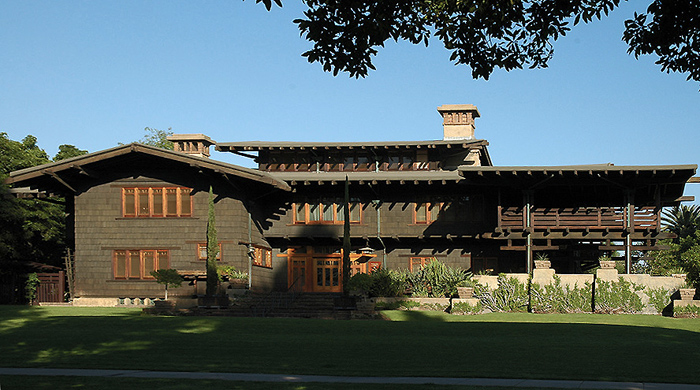
The Gamble House, Pasadena, California (Wikipedia Image)

In the United States, the influence of the Arts and Crafts Movement trended to greater influence the farther one headed west. This makes a great deal of sense, as farther west the ties to European cultural traditions wane, and those of a more uniquely “American “ form take prominence. It’s a combination of geography over time. There is perhaps no better expression of the Arts and Crafts in the West than in the hyper-craftsman, American masterpiece by Greene and Greene -- the Gamble House, in Pasadena, California. Built in 1908-09 and a National Historic Landmark, the Gamble House exhibits many of the key features of the craftsman bungalow, the West Coast version of Arts and Crafts buildings., the In designing a home that emphasized the fine hand carpentry of Japanese ornamentation and building forms rather than the work of the mason, the Greene brothers created one of the truly great American buildings of the 20th Century.  It was a far cry from East Coast, Euro-centric establishment architecture. This emphasis on a fine carpentry and an exotic (Japanese-influenced) design approach had far reaching effects in the western states, especially in the Pacific Northwest where the traditional use and great availability of softwood lumber made the execution of Gamble House-inspired designs a natural progression of the Art and Crafts approach. Additionally, the long overhangs of the Gamble House proved to be welled suited as a precedent for providing sound weather protection in our soggy, maritime climate.

Private Residence, North Capitol Hill

Private Residence, Volunteer Park

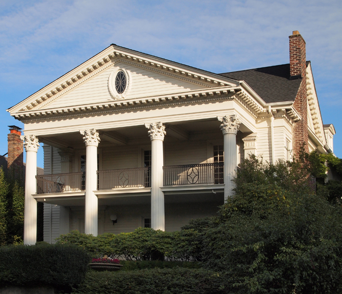
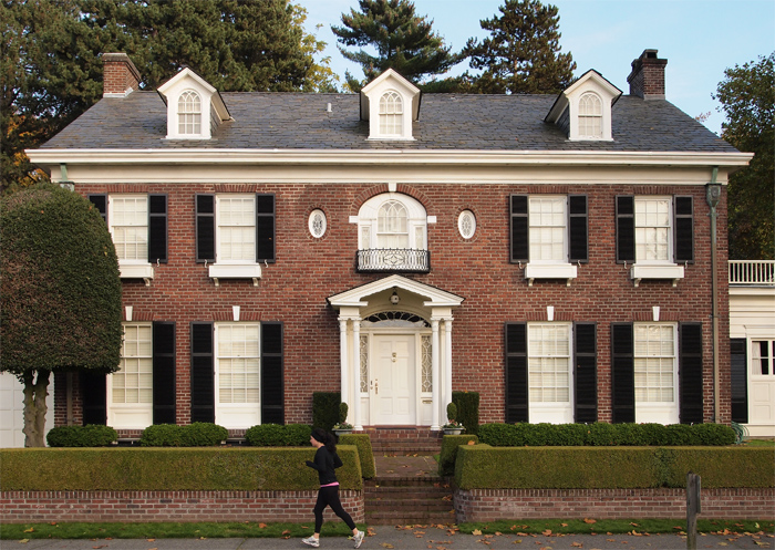
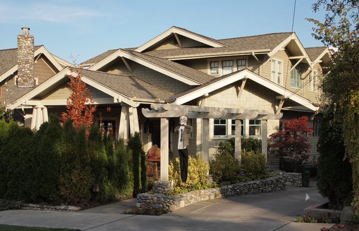
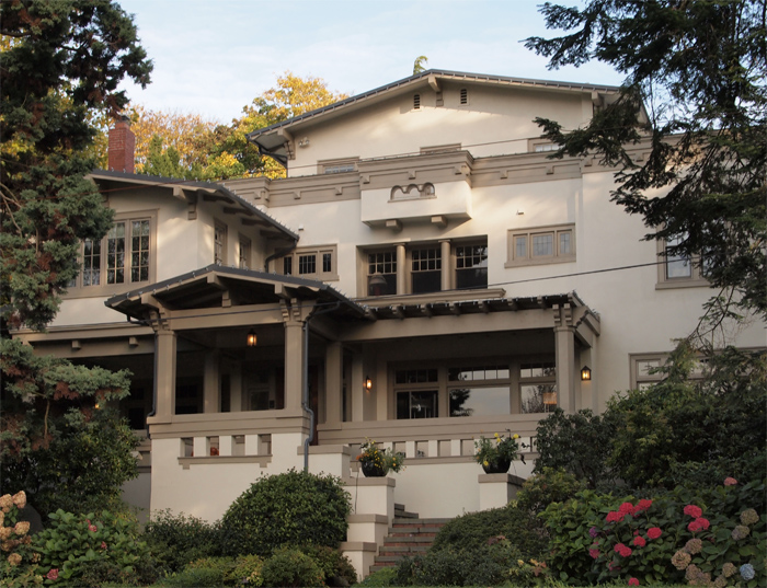
A bit closer to home ,in the environs of Volunteer Park, sits a splendid array of these opposing design ideologies – providing an interesting laboratory of East (Coast) verses West (Coast), as it were. Pictured above, are a pair of photos of classically/traditionally inspired homes. Corinthian columns, dentils, the reddest of brick, all the details abound, but I would argue they are bit out of place in the Pacific Northwest. In Boston, Richmond, or Charleston homes such as this are the norm, and speak to that coast’s cultural heritage and proximate influences. More indicative of our region are the two homes pictured below. The top one is a fairly representative bungalow, and lacks the symmetry, clear massing, and classical details of the two former homes. In their place are rafter tails, large overhangs, and details based in the tradition of carpentry, not masonry. The lower example, while not as strictly “craftsman” as the other and hardly humble, was most certainly designed by an architect and follows the new professional traditions then blazed by the Greenes.

Private Residence, North Capitol Hill

Private Residence, Volunteer Park

The Arts and Crafts tradition influenced more than the Craftsman type. Its progeny includes Tudor-influenced structures such as the Red House, some of which are also be found on Capitol Hill. Those structures, however, are not based upon the local materials and traditions, and for that reason are not grounded in our region as is the beloved craftsman -- as subversive in its disposition as the city that has made it a favorite.

Harrison Modern -- Funky Mid-Century Modern that Speaks to Today

I have been riding my bicycle past the Harrison Modern for almost a decade now, always appreciative of its  design and one that I have been yearning to share for some time. Unfortunately, its predominant exposure faces north, making its photography less than ideal for a majority of the year and thus potentially depriving the building the adoration it so deserves. Imagine my great joy when, a couple of weeks back, I was walking past in the late afternoon -- camera in hand -- with the lighting just perfect for portraying the Harrison's many charms.

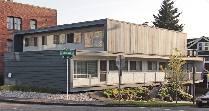
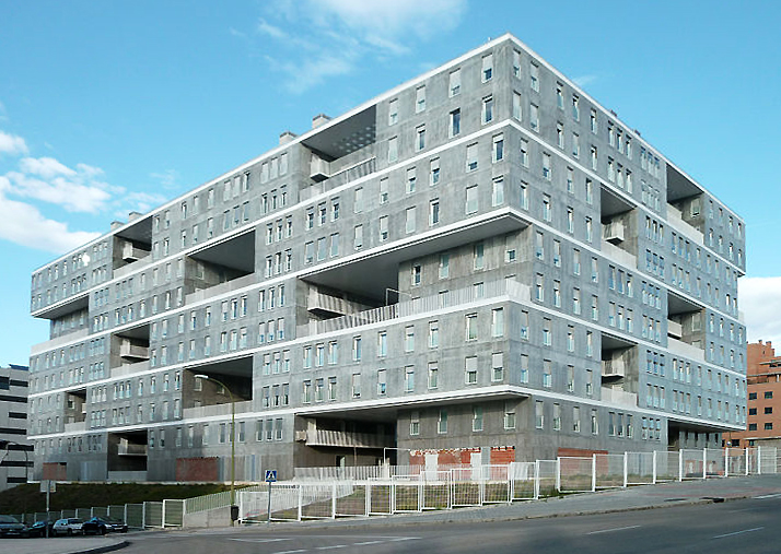
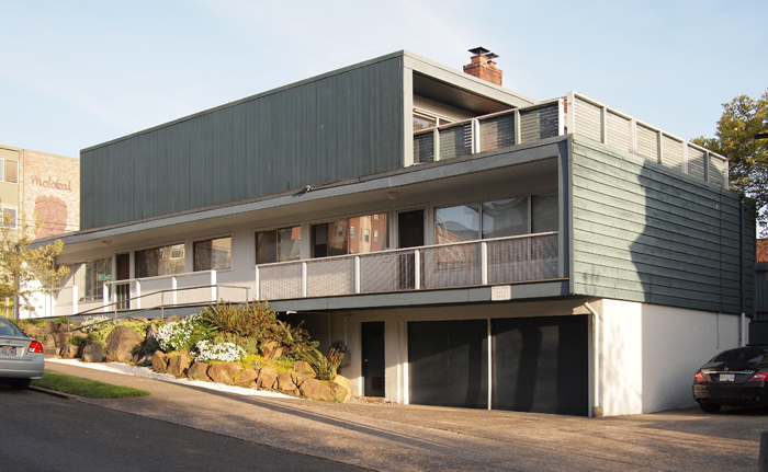
Located at the intersection of 12th and Harrison, the Harrison Modern is clearly a building whose designers were firmly rooted in mid-century modernism. Built in 1951 and designed by Victor Martin, the Harrison is not only exemplary of that era, but it also foreshadows current trends in architectural design in its use of layered cubic forms as exemplified by the work of such contemporary Dutch architects as MVRDV in the Edificio Celosía, pictured below. This stacking design approach, though all the rage now, was most certainly pretty avant-garde over 60 years ago, and continues to mark the Harrison unique among Capitol Hill's vintage buildings.

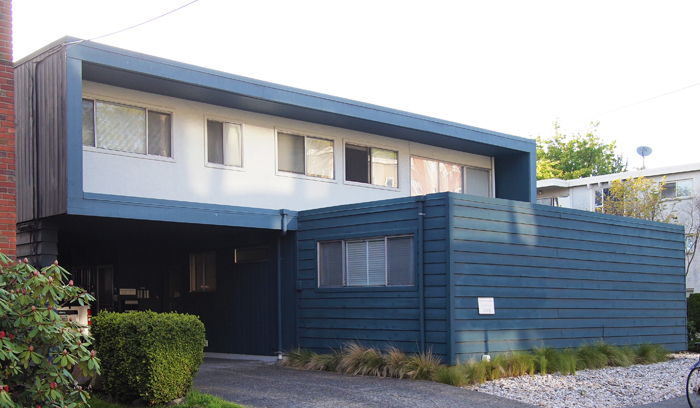
What I am calling a stacked or layered design is one where each floor (or grouped floors) is expressed individually and in a very like manner, without the more traditional base, middle, and top.  In both the Harrison and MVRDV example, this stacking is expressed not only by revealing the floor lines, but also by carving out voids for balconies that emphasize the volume of the floors above or below.  The Harrison's design captures this layered design approach to create cleverly framed outdoor spaces that exhibit the modernist desire forblending  indoor and outdoor space, including a generous upper floor balcony that must provide  a great view of the Puget Sound and Olympic Mountains. On a more intimate scale, the north facing veranda of the Harrison is  crisply framed, forming a powerfully simple, elegant, and dignified facade along Harrison Street.

Along 12th Avenue, the busier of the two streets upon which the Harrison is sited, a more formal facade was in order and is fittingly more massive in temperament. The contrast, and utility between, these three elevations is achieved by the simple rotating of the lower and upper floors to best suite their orientation, an ease of effort to effect that has long captivated me. A powerful difference is accorded between the two floors; on the longer, northern elevation is the lower form which represents the void, and on shorter, eastern elevation, it is the upper form. A lower floor ying to the upper floor yang, as it were.

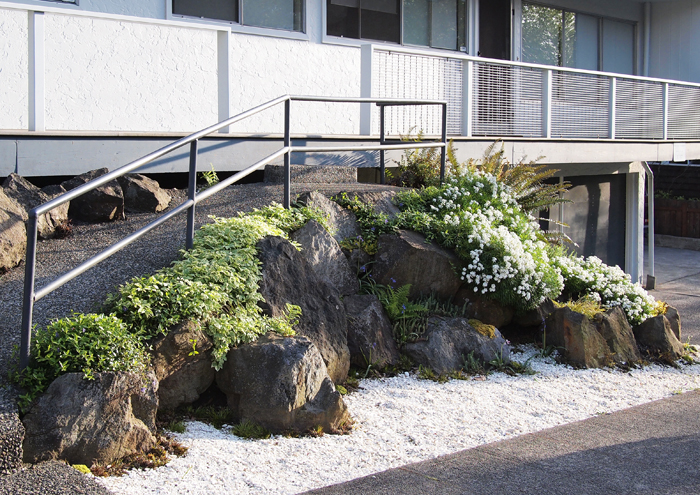
Contrasting the bold cubic forms above are the cascading stones and plantings that mark the entry ramp into the building. While on one level apparently quite different form the building's aesthetic, this little bit of landscape is actually within the spirit of its mid-century heritage, and provides a finishing touch to one of Capitol Hill's finest small buildings. If I squint a bit, I can imagine the Harrison at home in say, Palm Springs or Malibu, but am quite content knowing it is our neighborhood.

Create Communities of Opportunity

  On March 23rd, members of Schemata Workshop attended the Housing Development Consortium (HDC) 4th Annual Luncheon; HDC is a professional association and advocate for providing affordable housing in King County. Schemata Workshop is a sponsor and member of HDC and we are advocates for their cause. At the luncheon we were fortunate enough to have Angela Glover Blackwell, the Founder and Chief Executive Officer of PolicyLink, as the keynote speaker. Her speech was so inspiring that we were compelled to take notes summarizing the key components to create communities of opportunity.

First, Angela described the St. Louis, MO community where she grew up and how the neighborhood children played together in the front yards and streets without fear of danger. A community where her mother anxiously watched, perched out on the front porch, as she made her way to the corner store for the first time. It was an economically diverse community of doctors and lawyers living next to the single parent receiving food stamps. It was a community that fostered opportunity.

However, not all of our society experienced the same upbringing as Angela and members of our society have children that run the risk of not succeeding to their full potential. As Angela said, in these economic times, this is the first time that children are not expected to have the same opportunities as their parents. In addition, she emphasized that one’s housing determines so much more than we think. It determines the type of education and healthcare one can receive; also it determines what types of jobs are available. Those who work on housing and housing policies are indirectly working on health, education and job policies as well.

After painting the picture of an excellent community and emphasizing the need and importance of successful housing, Angela began to identify the key components to create communities of opportunity.

Creating Communities of Opportunities – 5 steps

1. Place matters

  • Creating a sense of place contributes to a sense identity for the community


2. Access to reliable transit

  • Provides the opportunity to seek better jobs, health care, and education


3. Integrate income levels and promote racial diversity

  • Provides richness of life and opportunity


4. Sustainability

  • Provide all 3 components of sustainability – environmental, social, economic equity


5. Inclusion

  • Integrate yourself in the community to understand their needs


The key components to create communities of opportunity are not new ideas individually, but we often forget that we need to take into account all components to provide successful housing. Angela ended her speech with the statement “Don’t be nostalgic for a time that never was.” However, I think we can use nostalgia to create goals for achieving communities of opportunity.