Urban Living

Biking Bullfrogs: Bike Month in Review

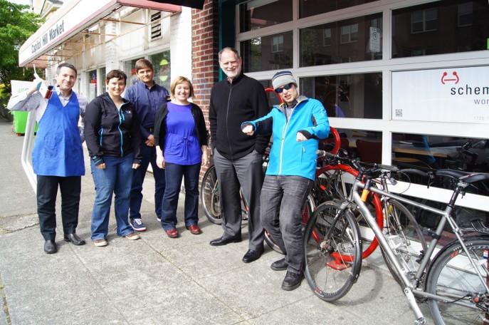
Bike to Work month has come and gone, but it has made a lasting impression on the office. We regularly have more people biking to work now than ever before, and even hold the occasional bike maintenance lunch-time workshops, held by one of our founding principals, Mike Mariano. Biking Bullfrogs 2012

We're already thinking about next year's Bike to Work month, and have several goals in mind:

  1. 100% Commute Rate.
  2. More office participation
  3. Encourage more local offices to join, and join our Capitol Hill league.

And finally, here are some Biking Bullfrog team stats:

  • Trips: 88
  • Miles: 465.4
  • Displaced CO2: 456lbs
  • Total Calories Burned: 22,803 - That's 73.5 McDonald's Cheeseburgers!

Harrison Modern -- Funky Mid-Century Modern that Speaks to Today

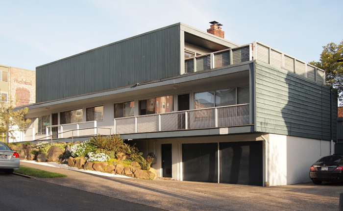
I have been riding my bicycle past the Harrison Modern for almost a decade now, always appreciative of its  design and one that I have been yearning to share for some time. Unfortunately, its predominant exposure faces north, making its photography less than ideal for a majority of the year and thus potentially depriving the building the adoration it so deserves. Imagine my great joy when, a couple of weeks back, I was walking past in the late afternoon -- camera in hand -- with the lighting just perfect for portraying the Harrison's many charms.

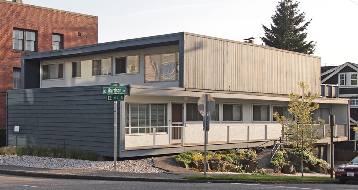
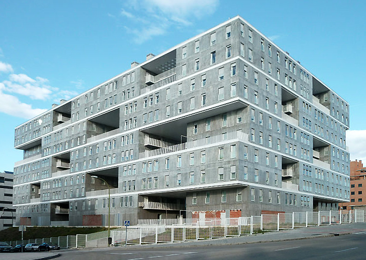
Located at the intersection of 12th and Harrison, the Harrison Modern is clearly a building whose designers were firmly rooted in mid-century modernism. Built in 1951 and designed by Victor Martin, the Harrison is not only exemplary of that era, but it also foreshadows current trends in architectural design in its use of layered cubic forms as exemplified by the work of such contemporary Dutch architects as MVRDV in the Edificio Celosía, pictured below. This stacking design approach, though all the rage now, was most certainly pretty avant-garde over 60 years ago, and continues to mark the Harrison unique among Capitol Hill's vintage buildings.

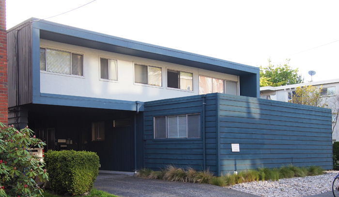
What I am calling a stacked or layered design is one where each floor (or grouped floors) is expressed individually and in a very like manner, without the more traditional base, middle, and top.  In both the Harrison and MVRDV example, this stacking is expressed not only by revealing the floor lines, but also by carving out voids for balconies that emphasize the volume of the floors above or below.  The Harrison's design captures this layered design approach to create cleverly framed outdoor spaces that exhibit the modernist desire forblending  indoor and outdoor space, including a generous upper floor balcony that must provide  a great view of the Puget Sound and Olympic Mountains. On a more intimate scale, the north facing veranda of the Harrison is  crisply framed, forming a powerfully simple, elegant, and dignified facade along Harrison Street.

Along 12th Avenue, the busier of the two streets upon which the Harrison is sited, a more formal facade was in order and is fittingly more massive in temperament. The contrast, and utility between, these three elevations is achieved by the simple rotating of the lower and upper floors to best suite their orientation, an ease of effort to effect that has long captivated me. A powerful difference is accorded between the two floors; on the longer, northern elevation is the lower form which represents the void, and on shorter, eastern elevation, it is the upper form. A lower floor ying to the upper floor yang, as it were.

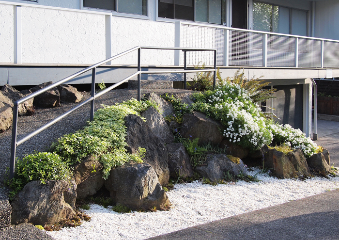
Contrasting the bold cubic forms above are the cascading stones and plantings that mark the entry ramp into the building. While on one level apparently quite different form the building's aesthetic, this little bit of landscape is actually within the spirit of its mid-century heritage, and provides a finishing touch to one of Capitol Hill's finest small buildings. If I squint a bit, I can imagine the Harrison at home in say, Palm Springs or Malibu, but am quite content knowing it is our neighborhood.

The Pinevue Apartment Building, and why it is worth saving

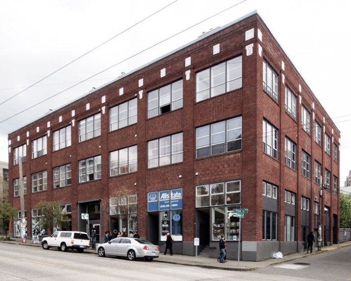
The heritage structures along Capitol Hill’s Pike-Pine corridor house mixed use, residential, and commercial tenants. The most prominent and best preserved of these buildings are the large number of former auto showrooms, the so-called auto-row buildings that are comprised of large-span ground floor spaces with high ceilings. Some heritage structures originally housed, as they do today, a mix of uses with ground floor retail and housing above. Some are strictly residential. These original patterns of development, or more specifically the pattern or planning for the building’s use, are reflected in their elevations. In those buildings along Pike-Pine that were originally commercial, the ground floor has expansive amounts of glass which are crisply framed by the building’s structure, with the resulting clarity carried out on the upper floors with little variation. A typical example of this rational, commercial frame expression can be seen along Pine Street, between Crawford Place and Summit Avenue.

Typical Pike-Pine Heritage Commercial Building

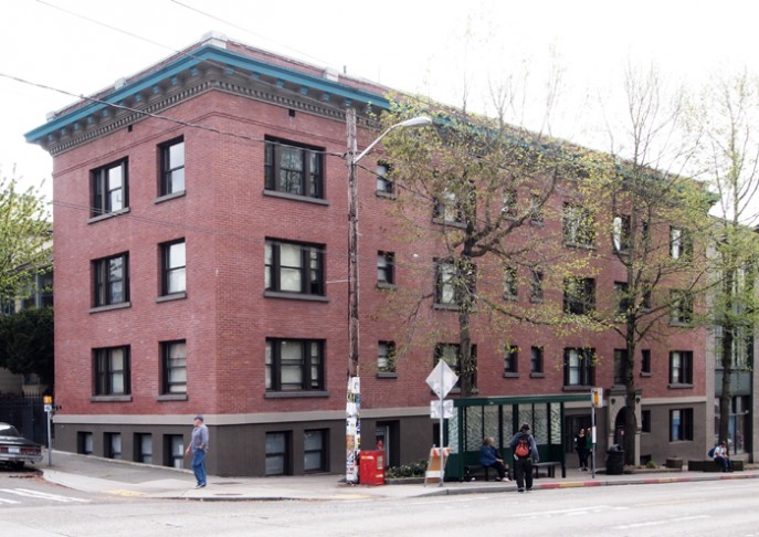
Capitol Hill’s residential buildings too, have a similar uniformity of expression between the ground and upper floors. In residential buildings, the expression was one of smaller, individually framed or so-called ‘punched’ windows, with the apartment building on Pine Street and Belmont being a fine example.


Typical Pike-Pine Heritage Apartment Building

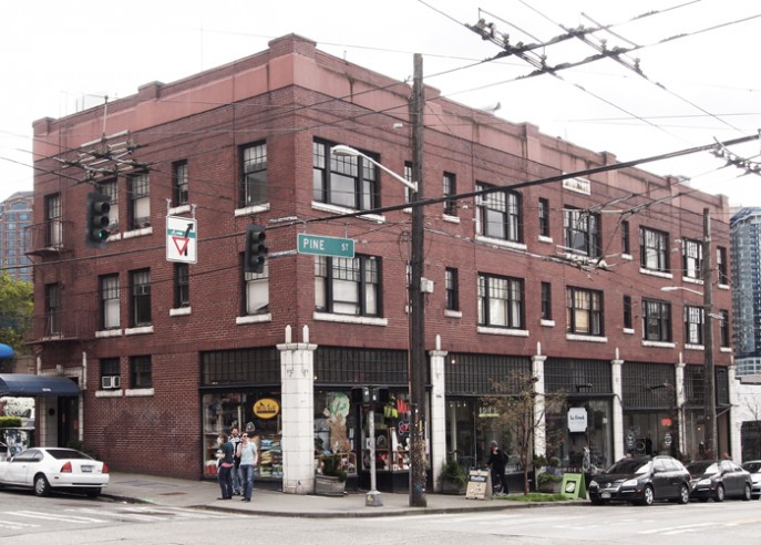
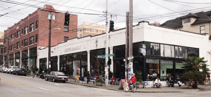
A unified expression between a building’s base and top was clearly not the primary goal for the designers of Pine Street’s Pinevue Apartments, making it a rarity among our heritage buildings. Next to the Melrose Building (home to Bauhaus), and threatened by the same re-development project, I would argue that architecturally the Pineview Apartments are just as significant, and just as worthy of preservation as is Melrose. Unlike the above mentioned typical Pike-Pine buildings, Pinevue presents us with a unique expression between lower and upper floors – an interesting merging of the expression of ground floor frame (commercial) and upper floor punched opening (residential). And though there are other buildings on the Hill that seek a strong distinction between base and top, none shows the same level of determination in differentiating their two uses as does the Pinevue.

The Pinevue Building

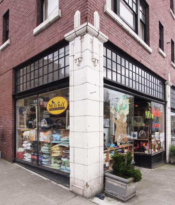
The Pinevue’s ground floor columns bear little resemblance to — or provide ordering for — the upper floors’ rather randomly spaced and grouped punched openings. This singular expression of the columns is furthered not only by the white of their terra-cotta but also by their framing the black painted storefront, not to mention being quite different than the dark red brick above. The fact that the columns are just slightly in front of (proud of) the brick is a wonderful detail that clearly punctuates the difference between base and top.


Pinevue Corner with Terr-Cotta Column

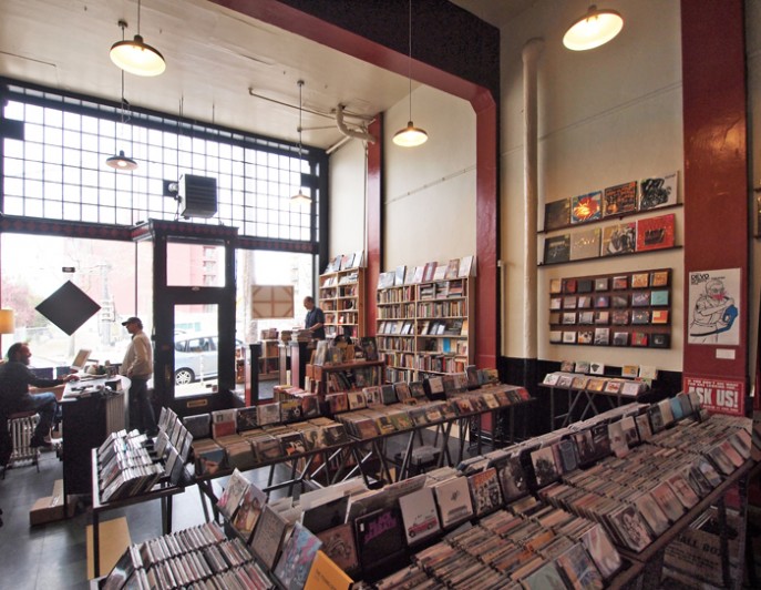
Retail Interior (Wall of Sound & Spine and Crown)

Despite these larger design moves that emphatically state the difference between commercial and residential uses, the Pinevue’s architects also looked to provide some unity to the upper and lower floors, but in a much more subtle way than one typically encounters along Pike-Pine, and in a way that did not conflict with the overall goal of programmatic differentiation. The small divided lights above the storefronts (especially handsome when seen from inside the retail spaces) are repeated on the residential windows above, whose terra-cotta sills are a match to the material of the columns below.  Another nice detail that weaves together the entire Pine Street façade is the crenelations along the parapet that are of similar dimension – but different materiality – than the terra-cotta columns that they line up with below. This confident uniting of what on the larger canvas are disparate parts with the smallest of details reveals a level of sophistication and maturity by the Pinevue’s architects that make this building one of the Hill’s finest buildings (as well as presenting a lesson for restraint for us to treasure and advocate for).

Angled Storefront

The Pinevue’s intact original retail design leaves no question that it was built expressly for smaller tenants, tenants that it continues to successfully house to this day. The architectural clues are abundant, and include numerous doors framed by a rarely seen diagonally oriented storefront, complete with the requisite delicate corners. These angle storefronts have served the tenants well, as they provide greater visibility of their wares to passersby, and stand in contrast to the typical, larger, and planar storefront retail spaces along Pike-Pine. The Melrose Building also has it original storefronts intact, resulting in an entire block-frontage of intact heritage structures with no significant sign of alteration, speaking to the ability of this quality pair of buildings to continue to successfully attract retail tenants throughout their almost 100 year histories. A noteworthy achievement indeed.

Melrose Building and Pinevue Building

Seattle Asian Art Musuem -- Art Deco Splendor in Volunteer Park (Part 1 of 2)

The Seattle Asian Art Museum (SAAM) in Capitol Hill’s Volunteer Park is a splendid building housing a magnificent collection of ancient and contemporary art. Designed by the Seattle firm Bebb and Gould (designers of many noteworthy structures in Seattle, including many prominent homes on Capitol Hill) and built in 1933, it originally housed the entire collection of the Seattle Art Museum. Set within Volunteer Park, SAAM shares its museum-in-the-park setting with other museums, including the Metropolitan Museum of Art, whose home is in New York City’s Central Park. As private collections predated by centuries those offered for public view, the museum-in-the-park typology finds precedent in that of the manor house in the landscape of either a noble’s estate in Europe or that of the landed elite of the East coast of the United States. Both the museum and the public garden are places of leisure, and their pairing is sensible, for sure, and allows for a full day’s outing both in and out-or-doors. In this tradition, SAAM and Volunteer Park present no less compelling a pairing than their historic or big city predecessors.
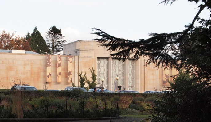
Art-deco (approximately the style in which SAAM was designed), to my mind, has always had a somewhat precarious and undervalued place within the history of modernist design. It never garnered the serious attention paid to many other 20th century movements, because it was seen, perhaps, as only a pleasant if not too serious ‘scenic’ detour along the thoroughfare of the more rigorous, international style modernism that eclipsed it. Architects, especially, like to see modernism as the built manifestation of industrialization and of the Enlightenment’s goal of human progress. Modernism’s emphasis on functionality, abstraction, and a machine aesthetic are well known. While modernist, art deco was perhaps too populist an expression of modernism’s machine aesthetic ideology, leading to deco’s being ultimately and sadly dismissed by ‘serious’ practitioners and their academies in favor of more somber fare. Ironically, deco’s embellishment with organic motifs and stylized figures doomed it to a short life even if those embellishments were crafted in the same materials, precision, means of that modernism propounded. Given its rather short life and relatively meager legacy, we are fortunate indeed to have such a building as SAAM, and that it is open to all to relish in.
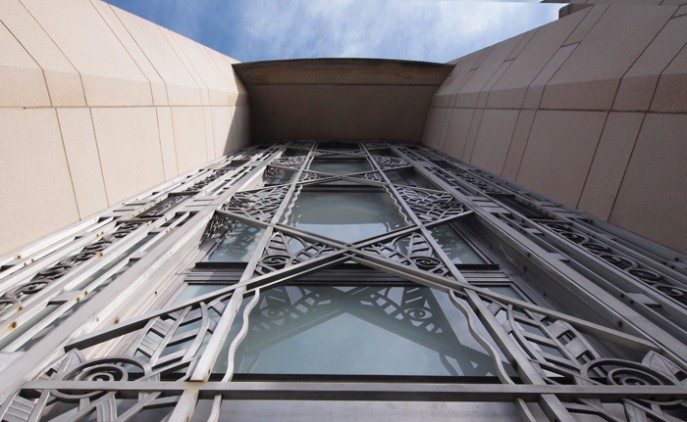
Among modern materials aluminum figures prominently, including in many art deco designs such as at SAAM.  While not a new material, aluminum’s manufacturing costs had been significantly reduced by the late 19th and early 20th century making it more readily available (until then, it was priced as was silver).  As important to its new, ready availability, was aluminum’s light-weight, corrosion resistance, and excellent casting characteristics -- the perfect combination of qualities for the ornamental metal work sought by art deco architects. Add to that the fact these qualities allowed it to be utilized in its pure and visually uncompromised form (by being either polished or clear anodized – not painted) and you have the almost perfect ‘new’ material for the ‘new’ architecture, with no Seattle example better (art deco or otherwise) than in the spectacular aluminum screens and doors that comprise the entry at SAAM. With its organic motifs, shininess, and casting precision, the entry screen ranks among the best architectural features of any building in our city. And, dare I say, many an architect’s current fetish with screening and de-materializing could learn much from the effectiveness of SAAM’s entry screens in achieving those same qualities, the full effectiveness of which are realized best upon entry into SAAM (so go ahead, go in!).
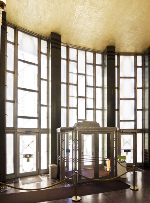
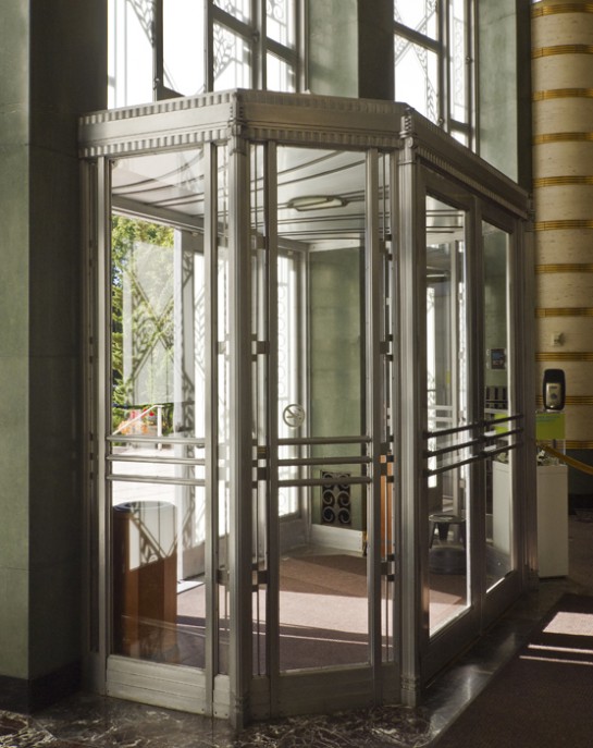
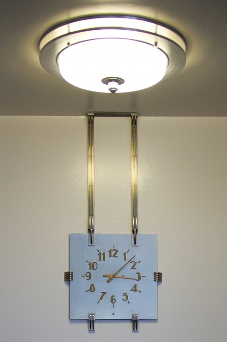
Upon entering SAAM, one is impressed by a lobby that is of a grandeur befitting not only the institution itself, but also of the powerful design vocabulary offered by art deco. Still in a relatively early stage of modernism, art deco had to resolve many new and modern functional requirements, oftentimes without the off-the-shelf products available to today’s practitioners. Things that are now easily ordered from a vendor’s product line were either unavailable or were sufficiently rare enough that the architect had to design those elements themselves. In the skillful hands of SAAM’s architects, such commonalities as air grills, light fixtures, clocks, or doors became objects d’art in-and-of themselves, and are a testament to a comprehensiveness of design mostly absent from today’s buildings. While it is true that standardization has made such objects much more attainable (and therefore useful), there is something lamentable in this loss of design-in-depth. There is no escaping the observation that despite their adding of flourishes to such functional objects, there is an underlying and guiding reliance on streamlined aesthetic resulting from industrial manufacture – an aesthetic that (is essentially the same and) holds its own against a more ideologically correct modernism.
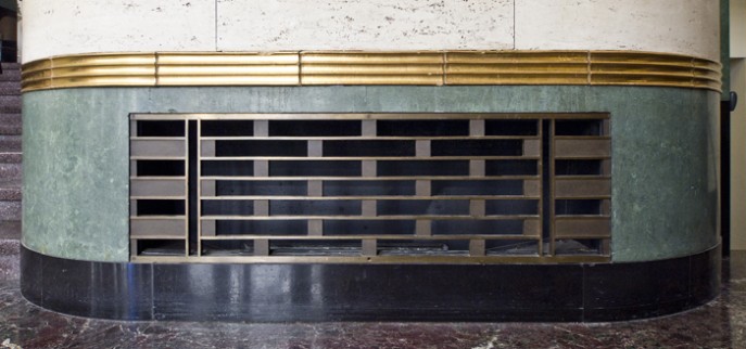
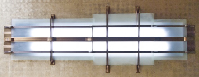


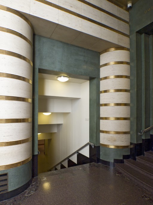
This being art deco, there is more to see than stylized architectural furnishings in SAAM. Gold foil, polished and richly veined marbles, and of course, curved surfaces abound. Despite this potentially chaotic assemblage of luxurious materials and forms, there is a skill in their assembly at SAAM that creates not only sumptuous spaces, but adds a dignity and refinement befitting of the art contained within -- which is the focus of the next post -- the architecture of the galleries themselves.